Branding — 2022
LiveReach AI Rebrand
LiveReach AI rebranded from LiveReach Media in the fall of 2022. As the lead designer I helped develop and launch a new brand identity system, logo and website.
Tools: Adobe CC, Sketch, Figma
About
LiveReach AI (LR AI) is a company that offers enterprise video security and motion intelligence on a cloud-based platform. Formerly known as LiveReach Media, the company was looking to rebrand to reflect the company’s evolving product and reframe their audience’s perception about the company. LiveReach AI needed to be a brand that spoke as reliable, secure, and trustworthy— a reflection of their security systems. I worked closely with stakeholders and the company’s founders in this brand refresh.
Rebrand
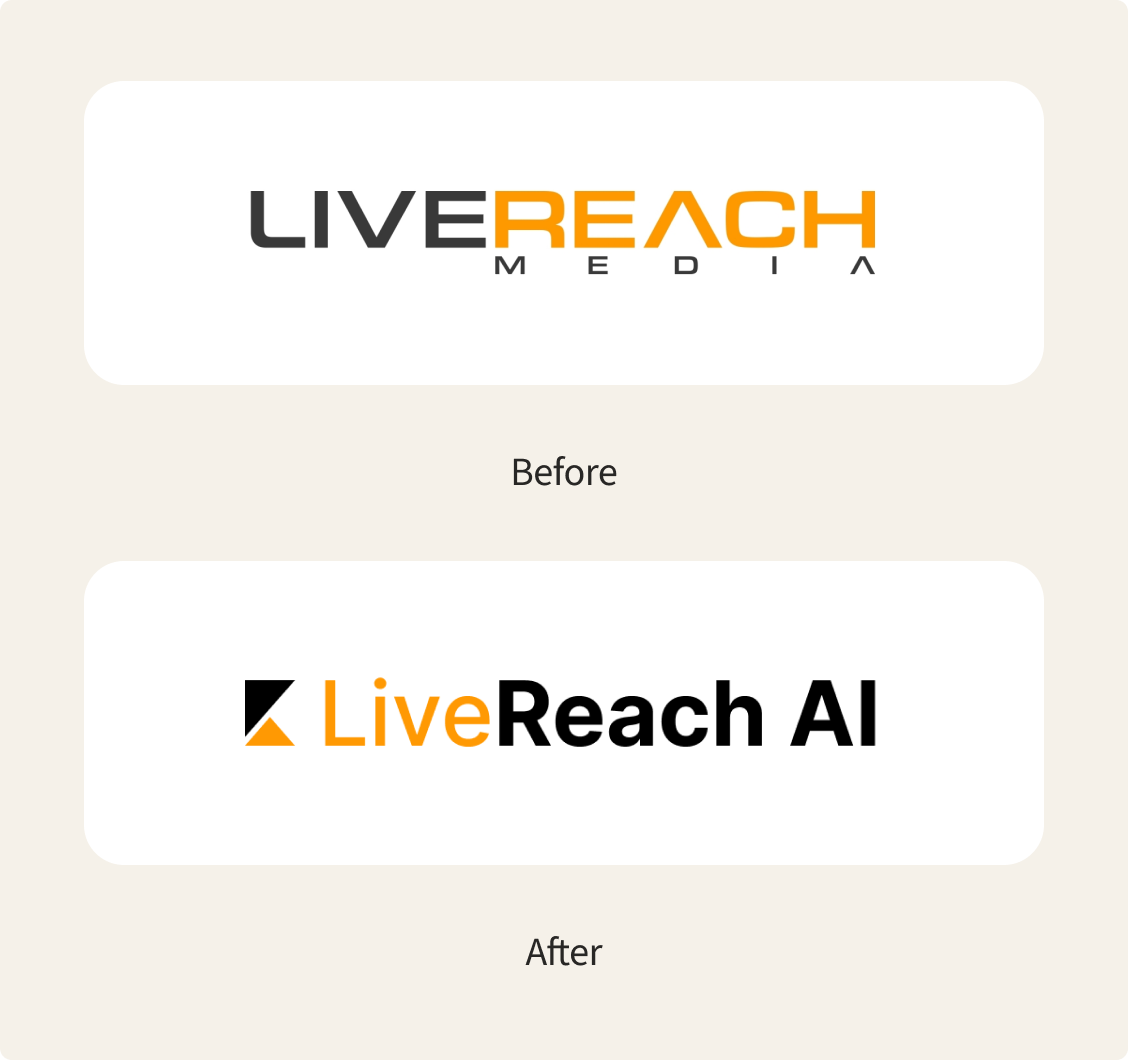
The founder and CEO felt that the brand’s overall look and feel did not accurately reflect the brand and company values. As a small startup company, there was a need for a more professional and innovative, tech-focused aesthetic to their visuals. Cohesiveness was an important aspect to focus on across the entire brand ecosystem for clarity, organization and future scalability.
The name change from LiveReach Media to LiveReach AI was made to better represent the company’s current focus and unique selling proposition on artificial intelligence within their security systems.
Logo Design Process
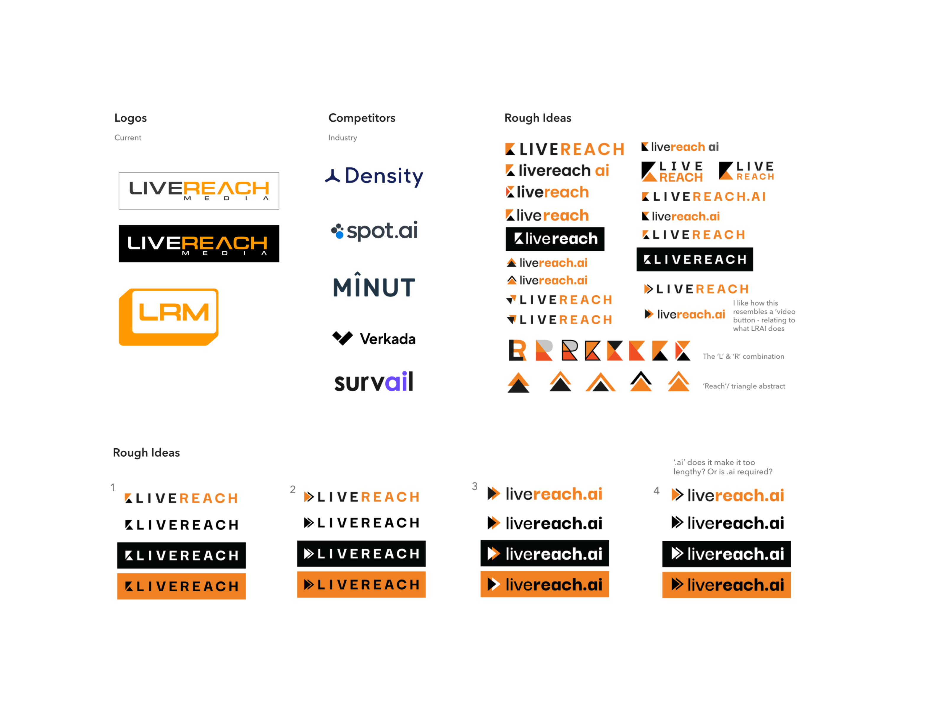
Design exploration
A few different options were explored since we were aiming for a visual refresh. The only thing that stayed the same was the brand’s core colors. In addition to a wordmark, an abstract logo was requested.
New Branding System

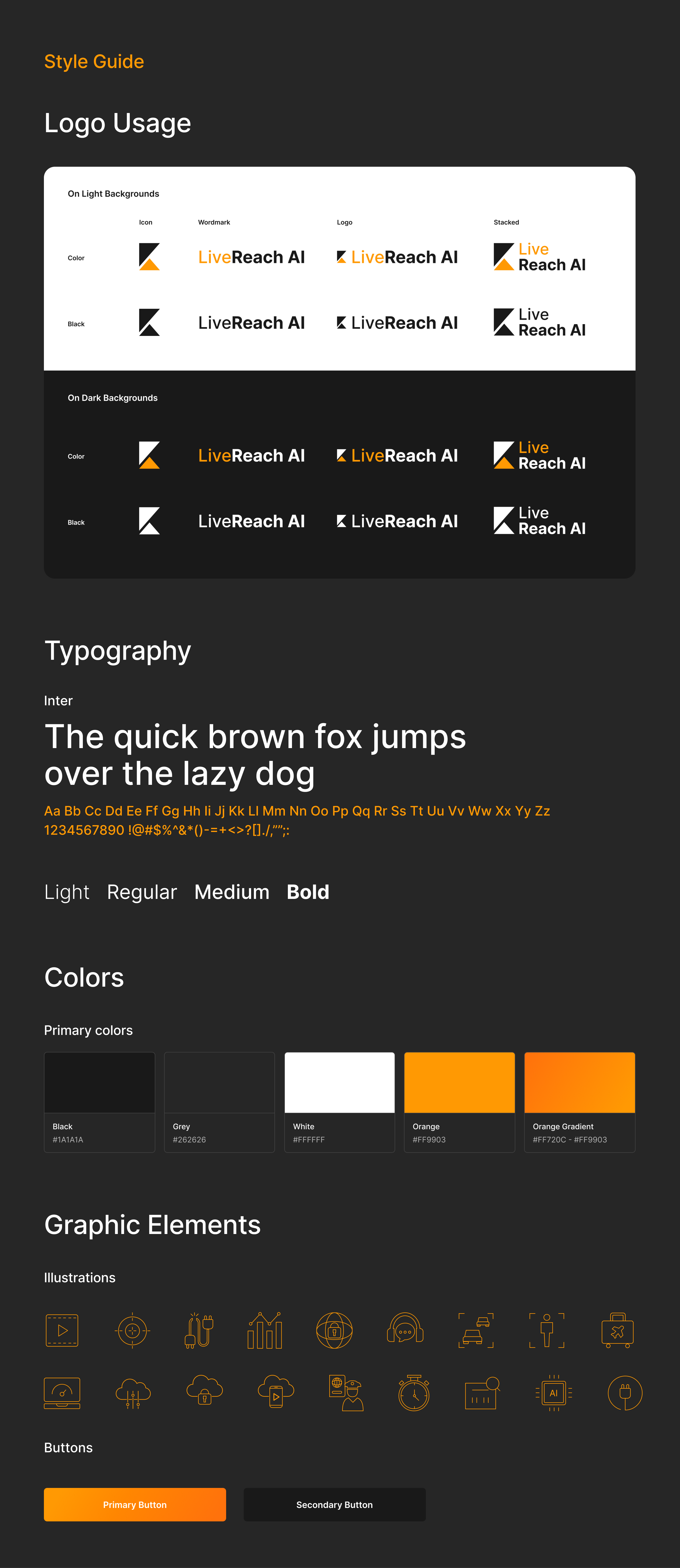
Logotype
The logo shapes and abstraction come from a combination of the letters L and R. The triangles are suggestive of direction. Multiple formats of the logo are needed for different use cases and is made to work on both light and dark backgrounds.
Website
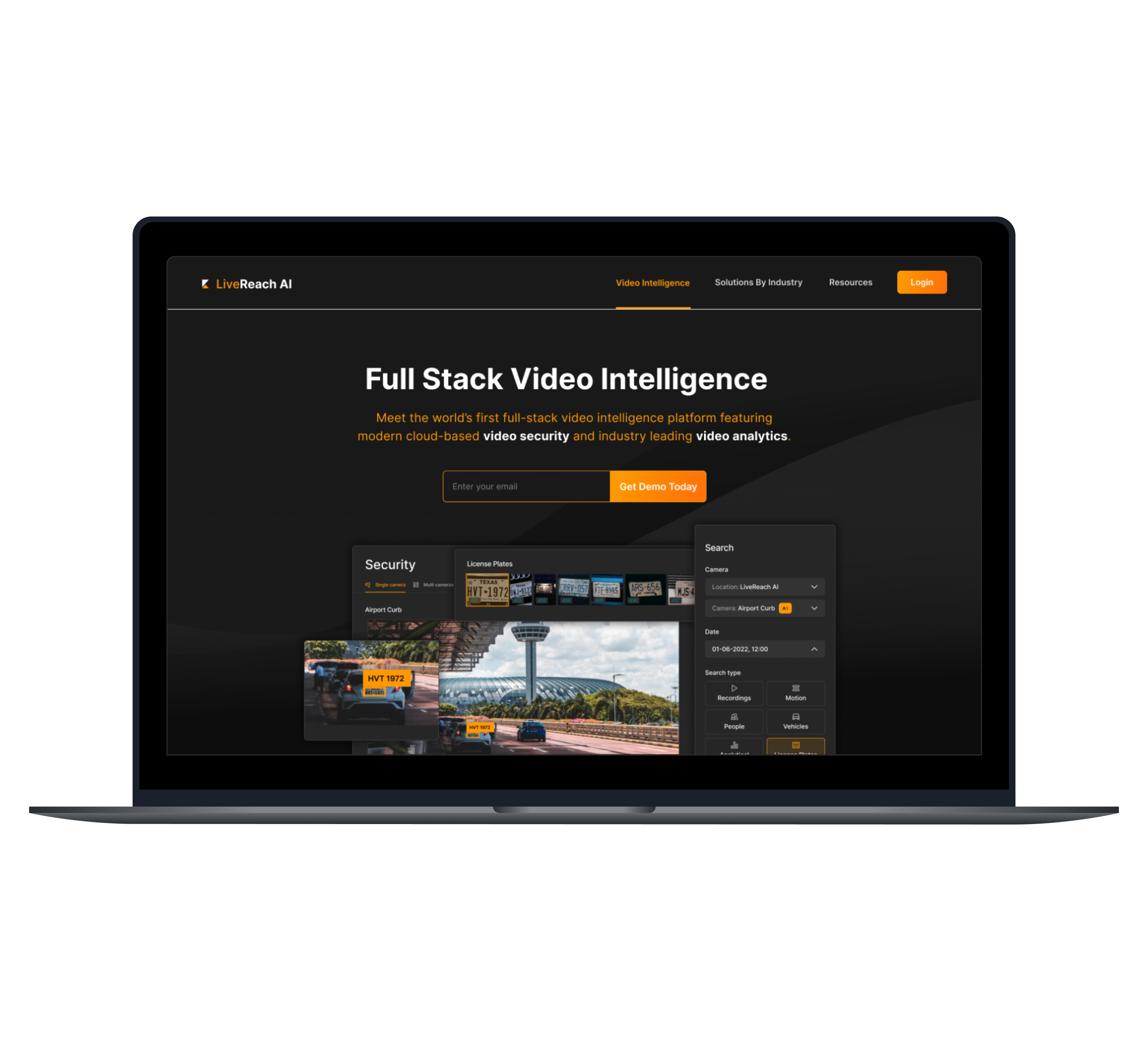
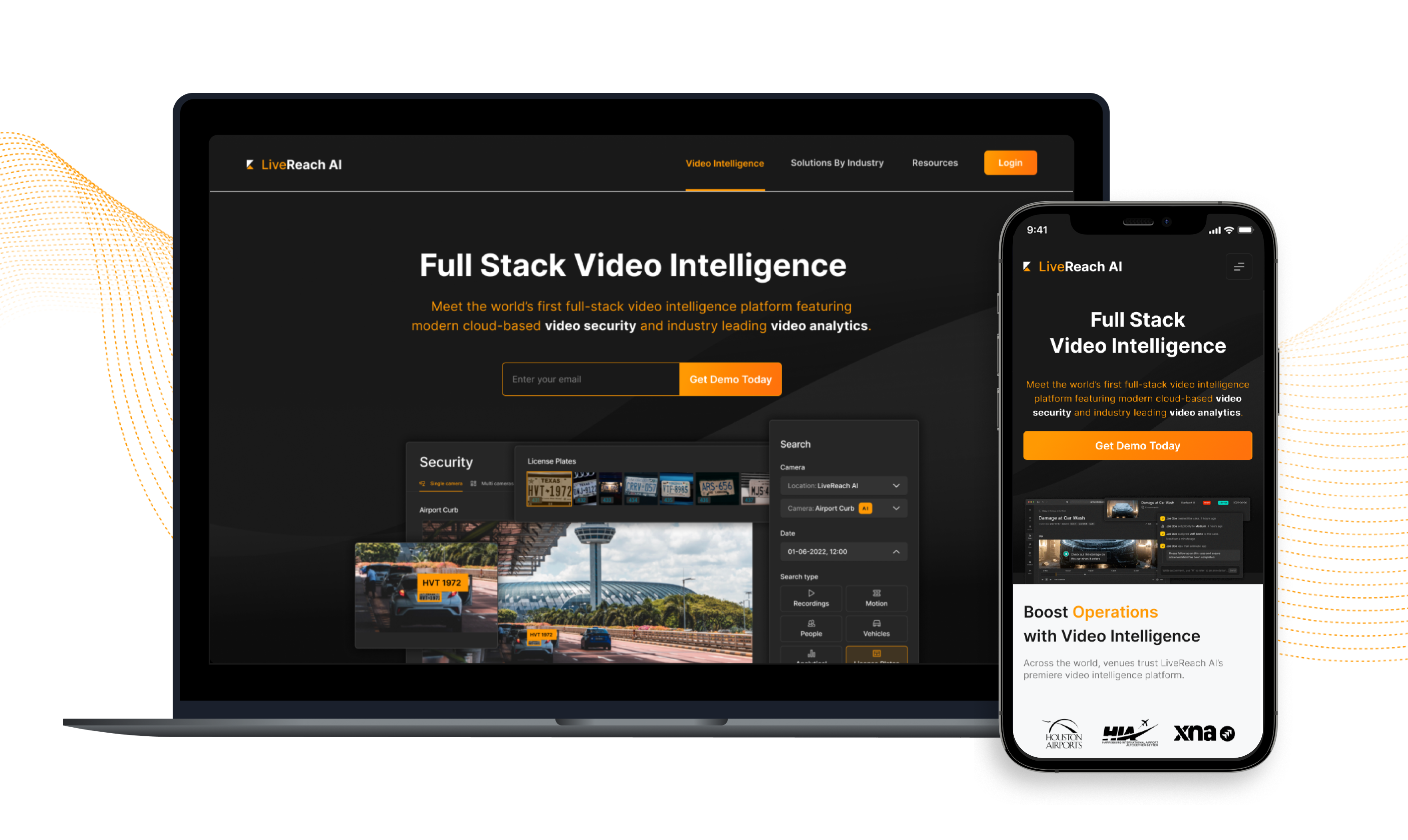
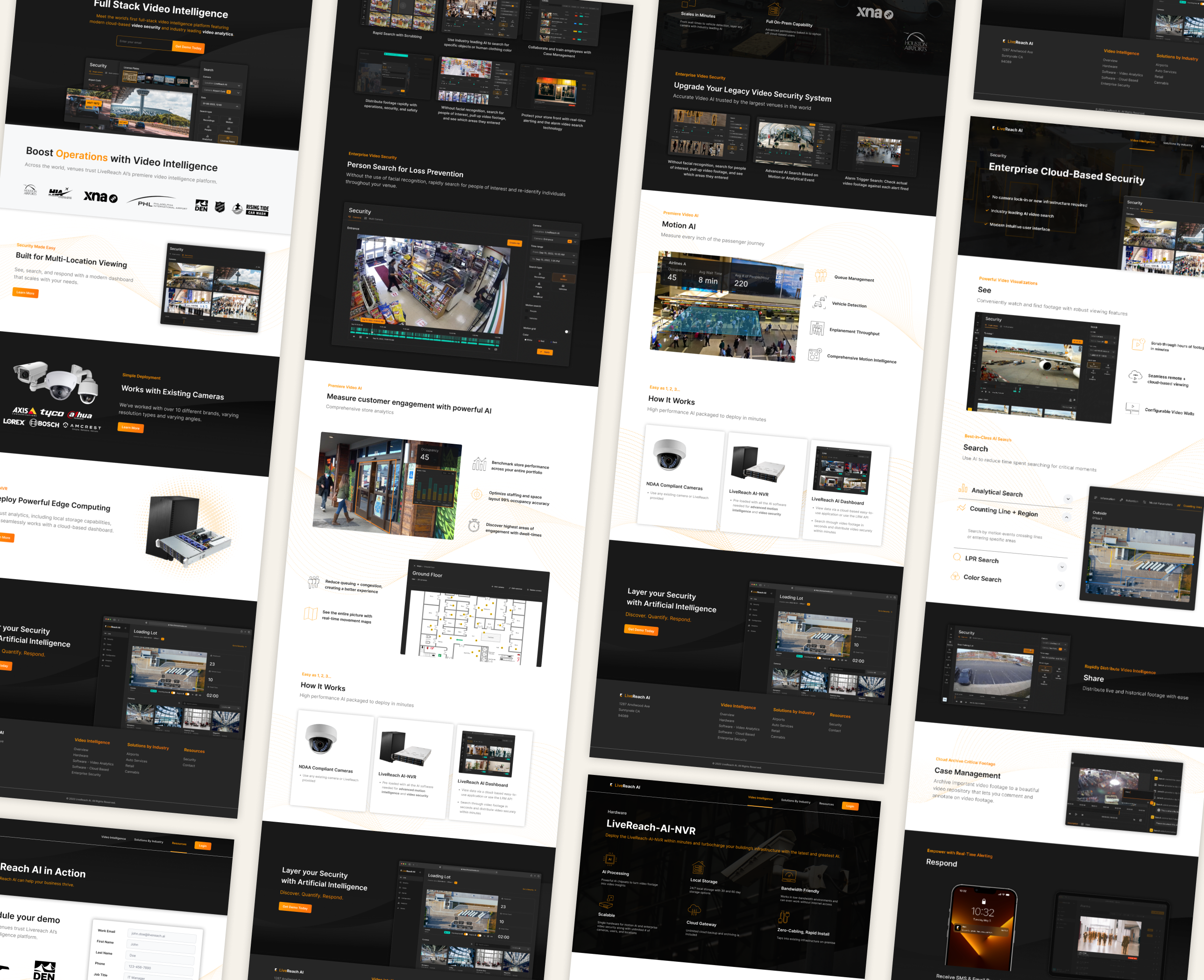
With the new branding completed, a redesign of the company’s website was made to reflect those changes. There were also a number of problems with the website that needed to be addressed. I was responsible for prototype design and their front-end developer implemented these changes.
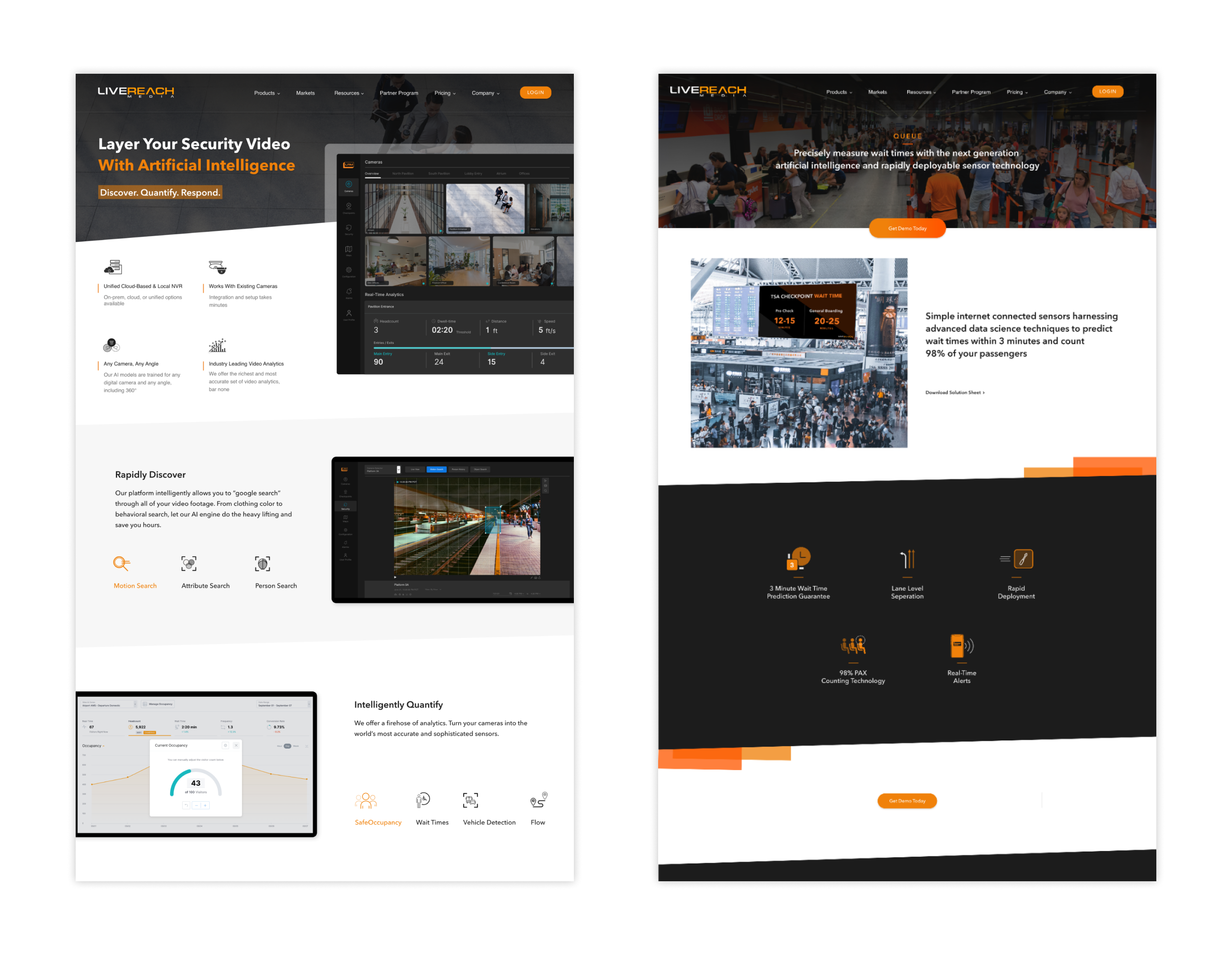
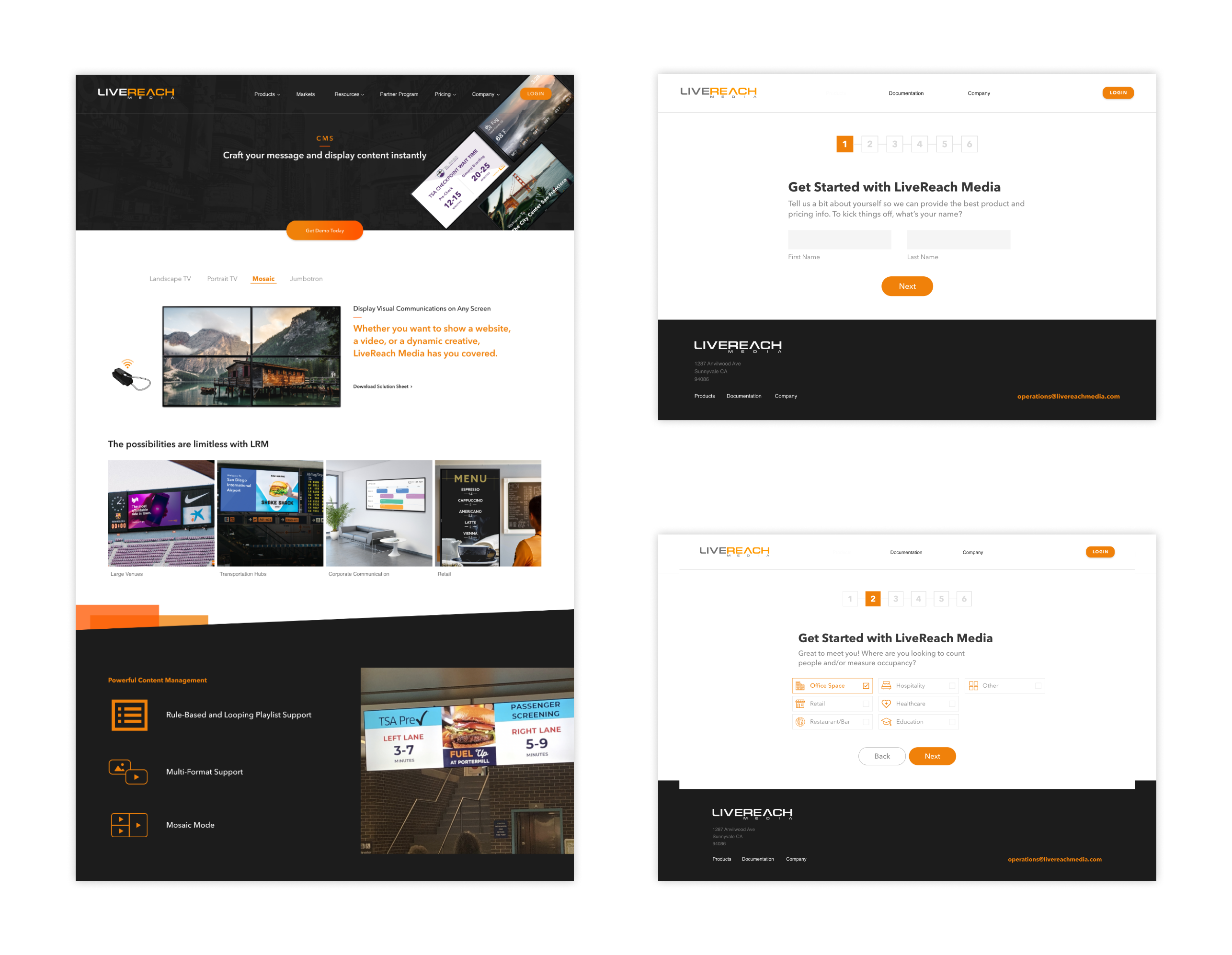
Before
Problems with the old website included inconsistent graphic elements with the UI, confusing information architecture and unclear CTAs. Some of their forms, such as the demo sign up, were set up in an unnecessarily complicated and lengthy process. Goals for the redesign were to improve usability, performance and visuals.
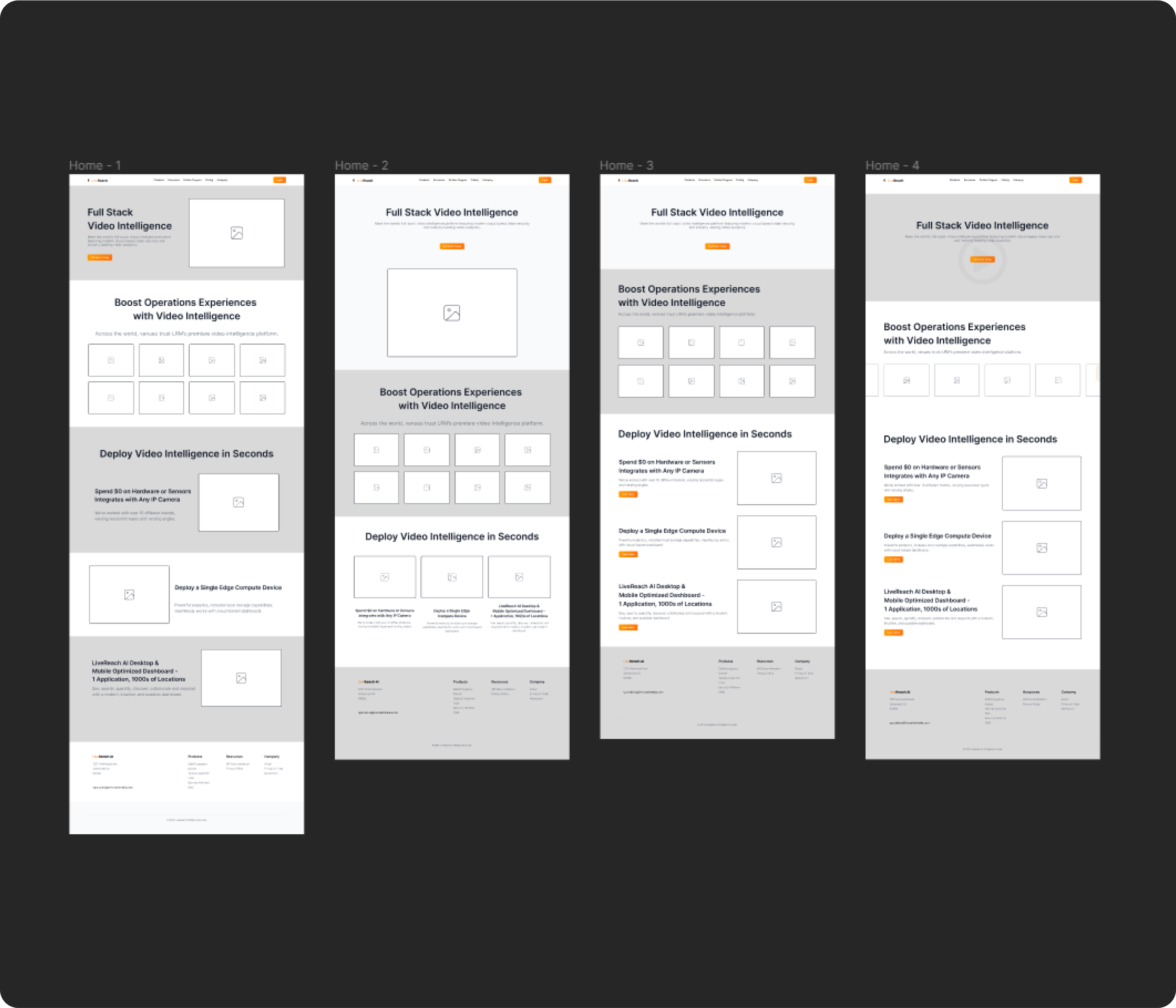
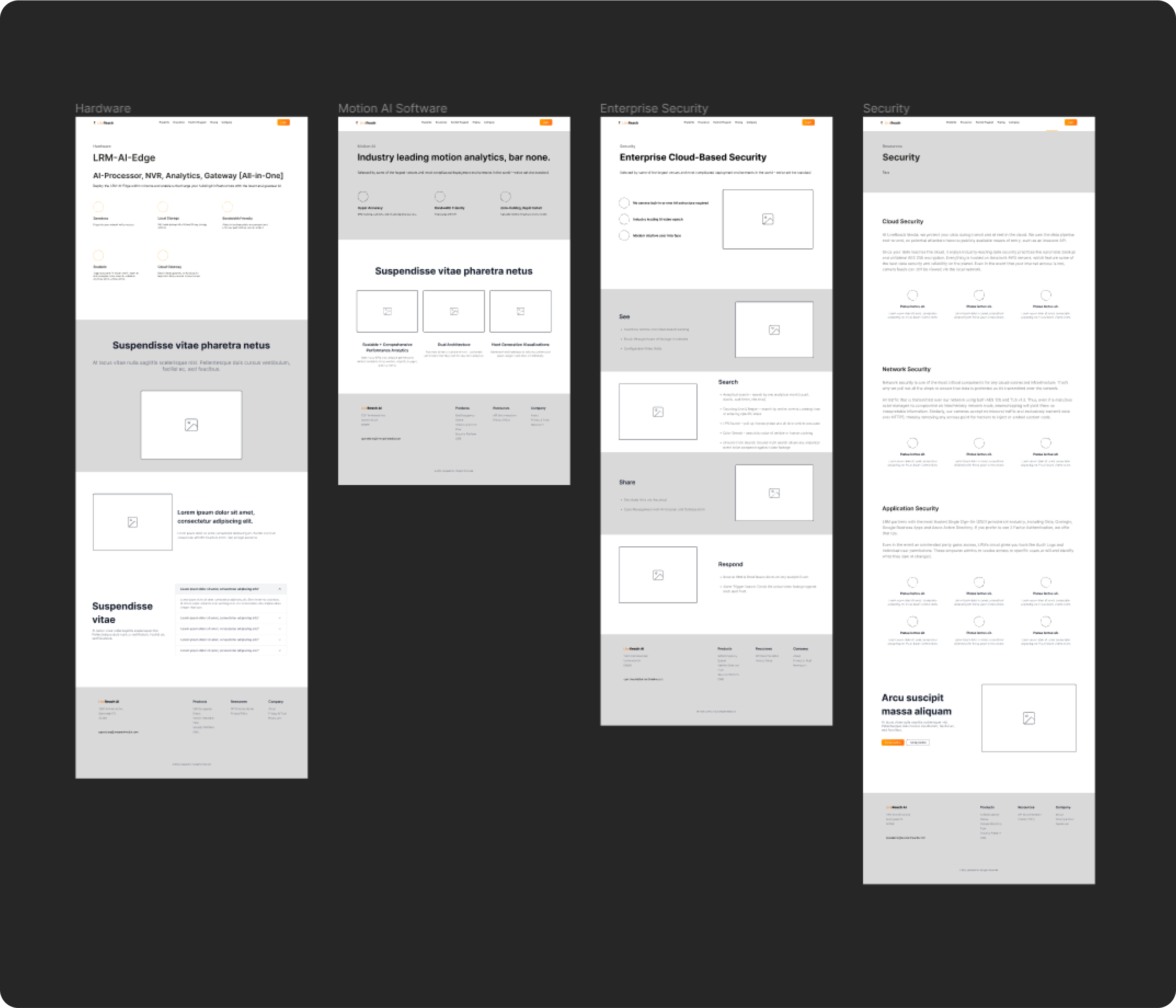
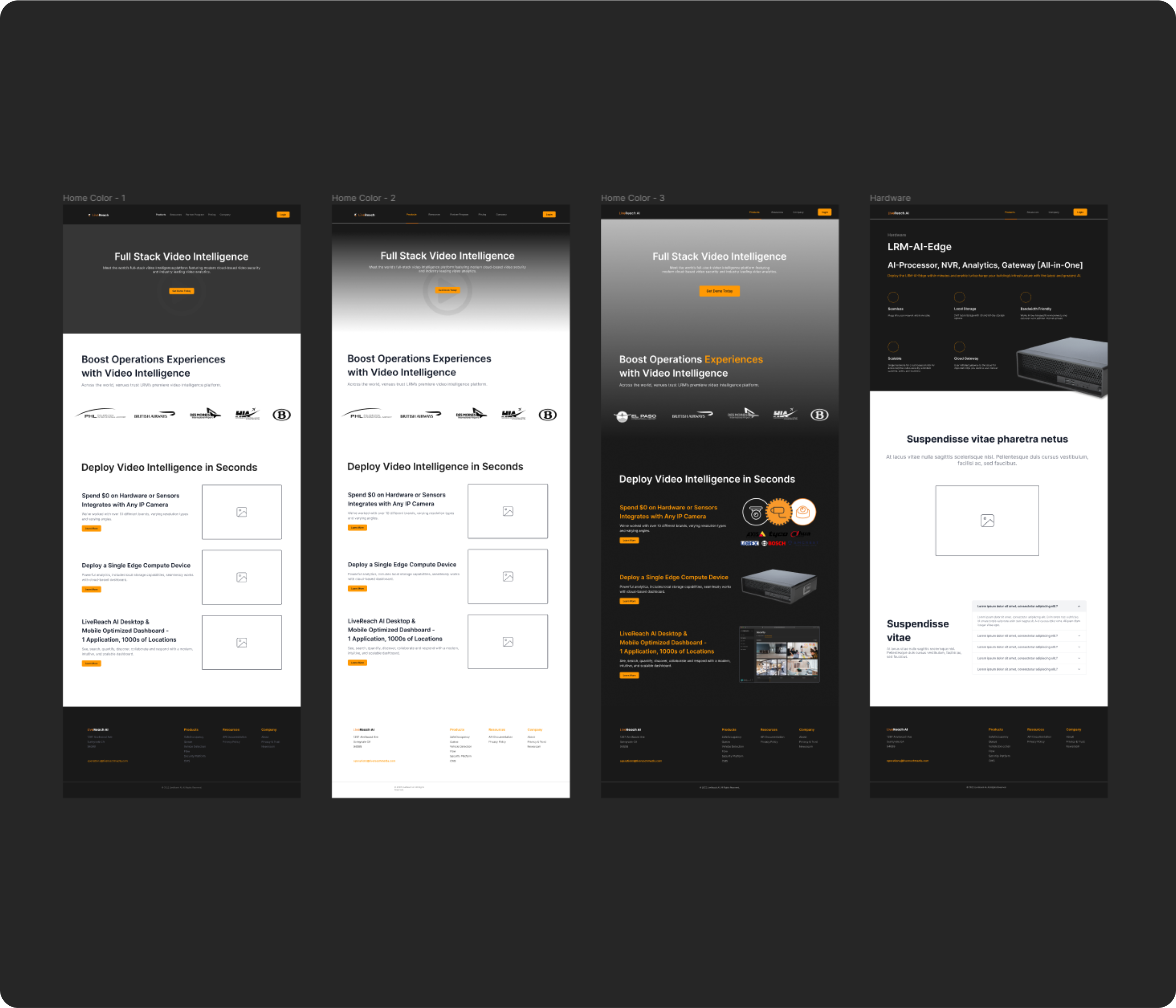
Wireframes
We worked towards a clean, concise and visually engaging website. Focusing on an easy-to-navigate experience to help user’s understand LiveReach AI’s product offerings and to find the solutions they need quickly.
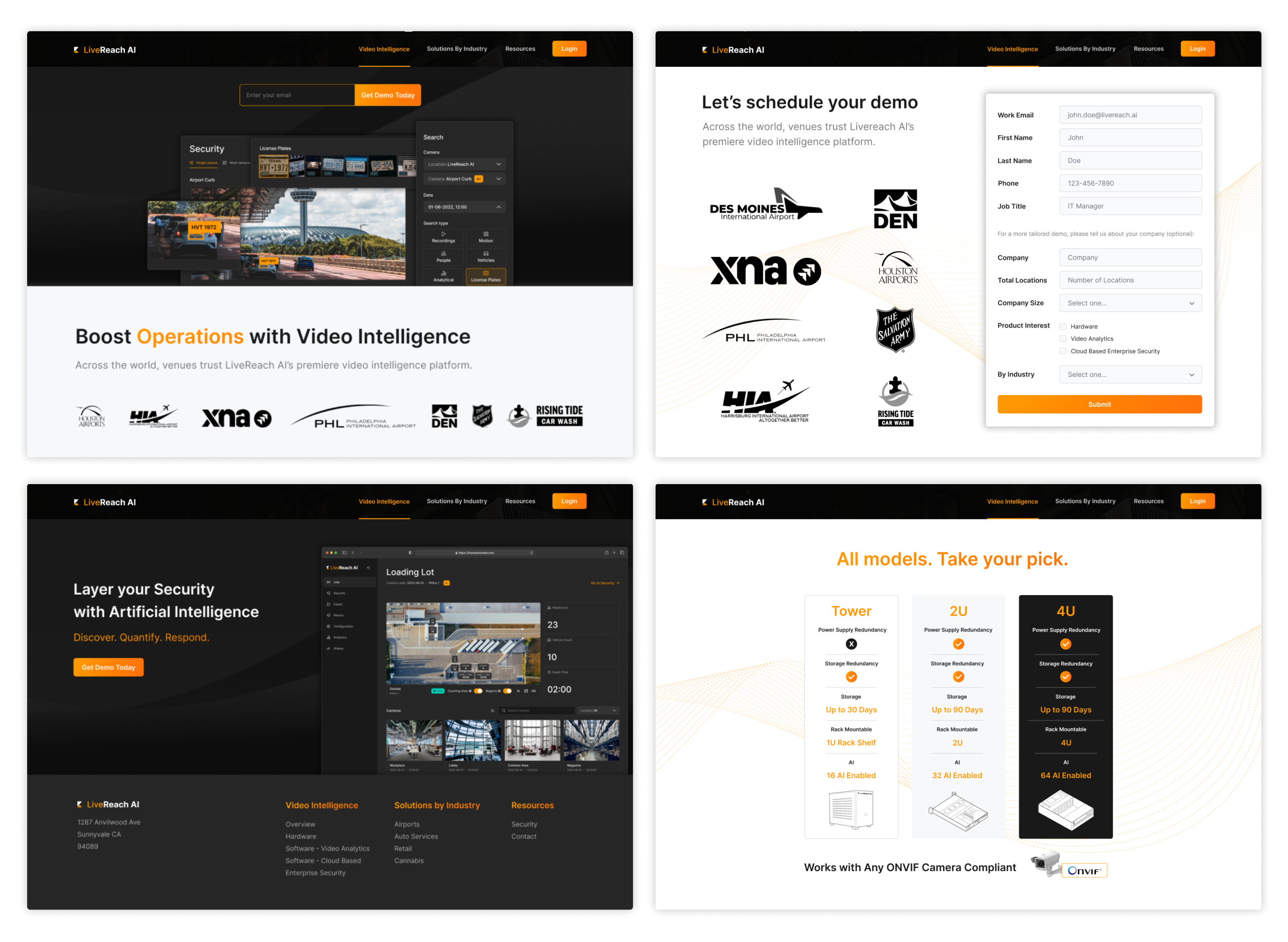
Finalized Website
Brand Materials
Result
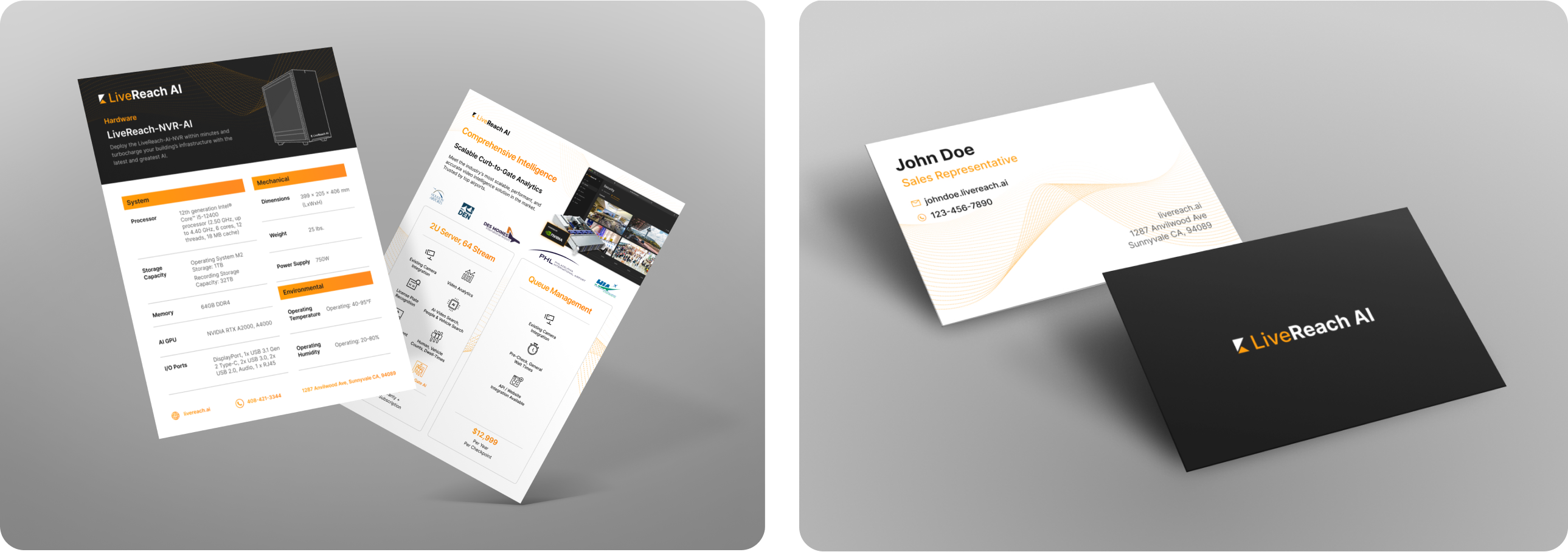
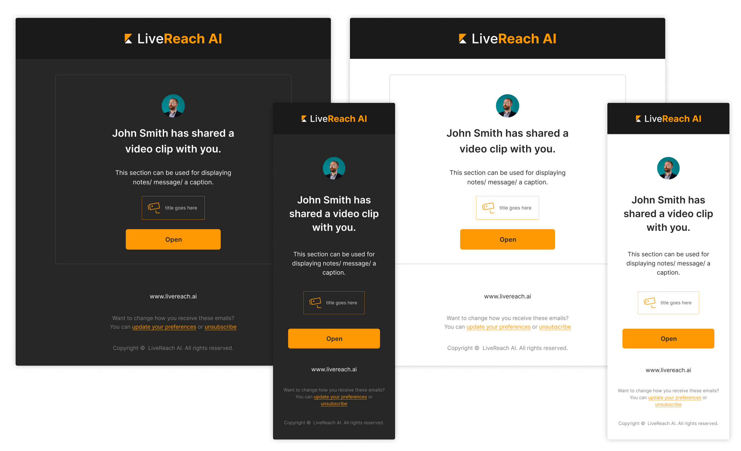
The rebrand has helped this small startup increase sales and tap into new target markets. All company documents and marketing materials have been updated to match the new visual identity. Both externally and internally, the company’s image has become more professional, one that speaks as reliable, secure, and trustworthy with cohesive brand consistency across all platforms.
