Branding — 2023/2024
Ignite Reading Rebrand
In 2023, Ignite Reading rebranded with a new logo and website. As the sole designer at this small edtech startup, I led the development and launch of a new brand identity system.
Tools: Adobe CC, Figma, Wordpress
About
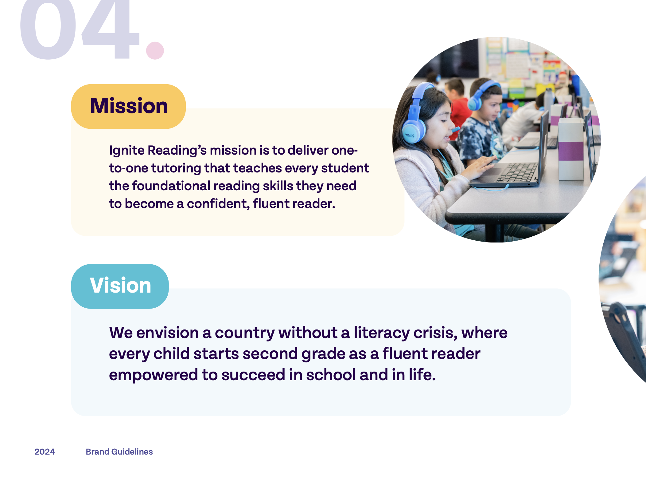
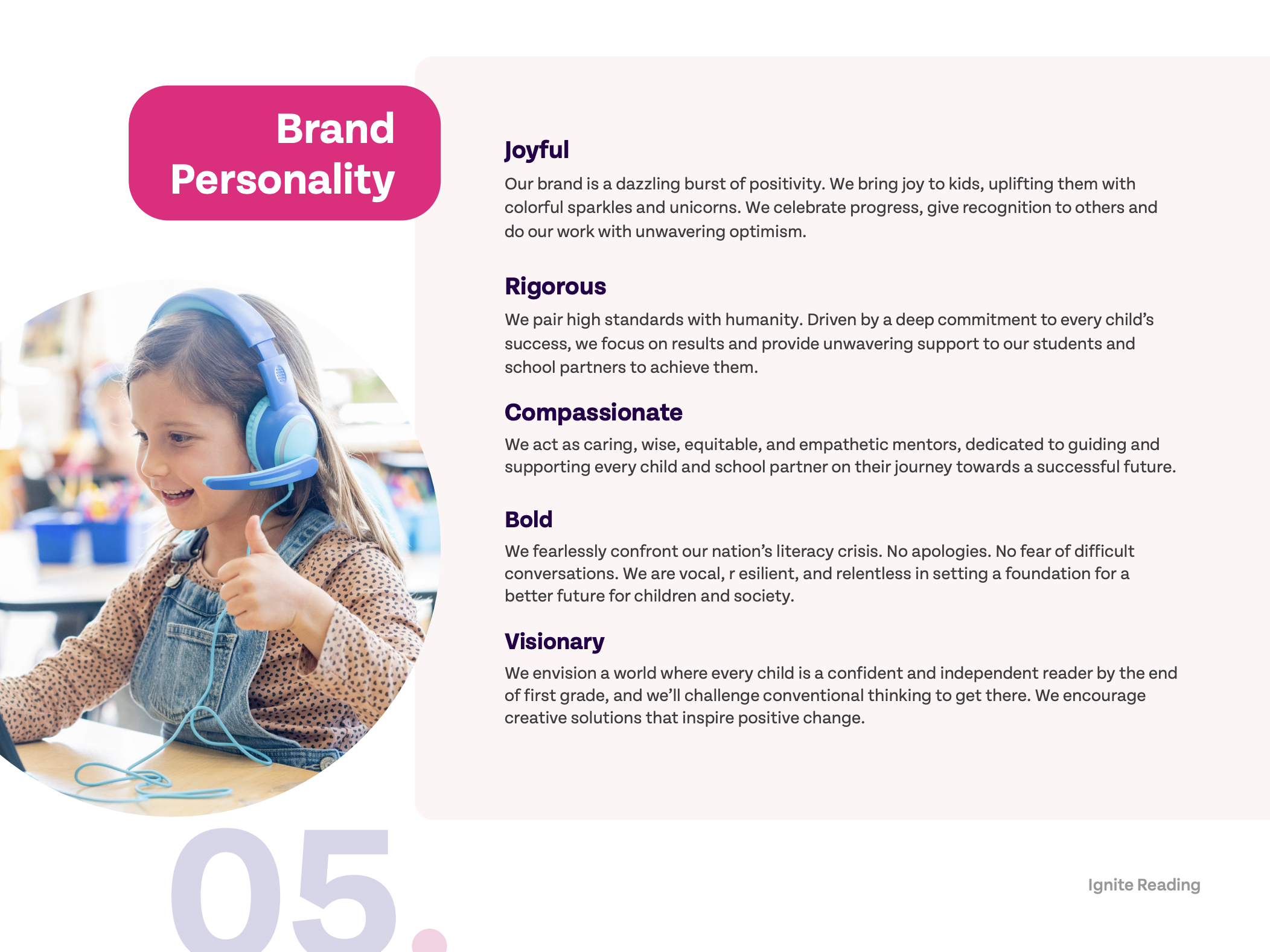
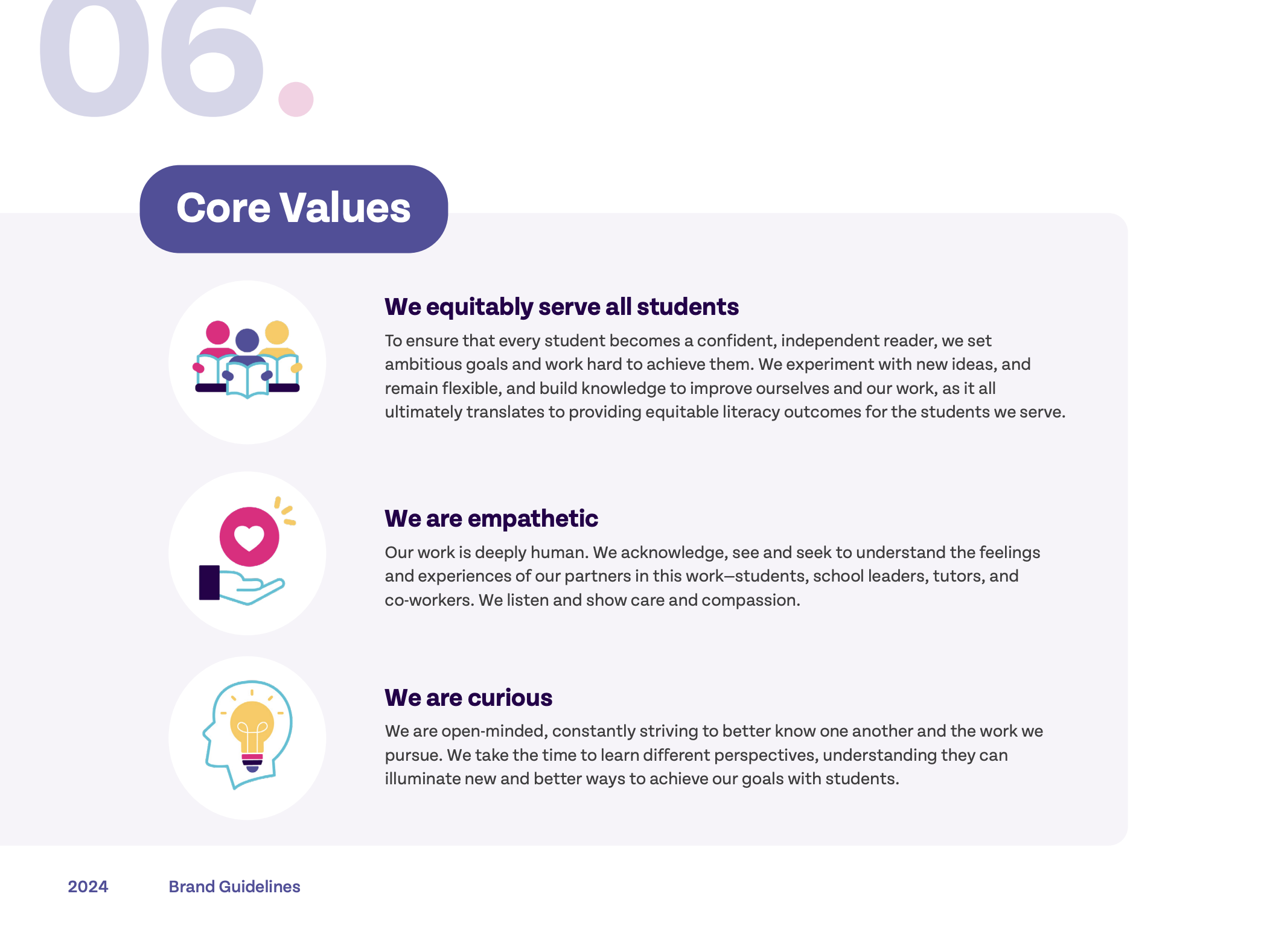
Ignite Reading is a one-to-one virtual literacy tutoring program focused on closing early reading skill gaps through high-impact, individualized instruction. When I joined the team, the company had recently partnered with an external agency to launch a new logo and website as part of a rebrand. Building on that foundation, I refined and expanded the brand identity—developing clear, cohesive design guidelines and applying them across all brand collateral to ensure consistency and elevate their visual presence.
Rebrand
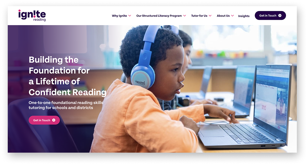
Website
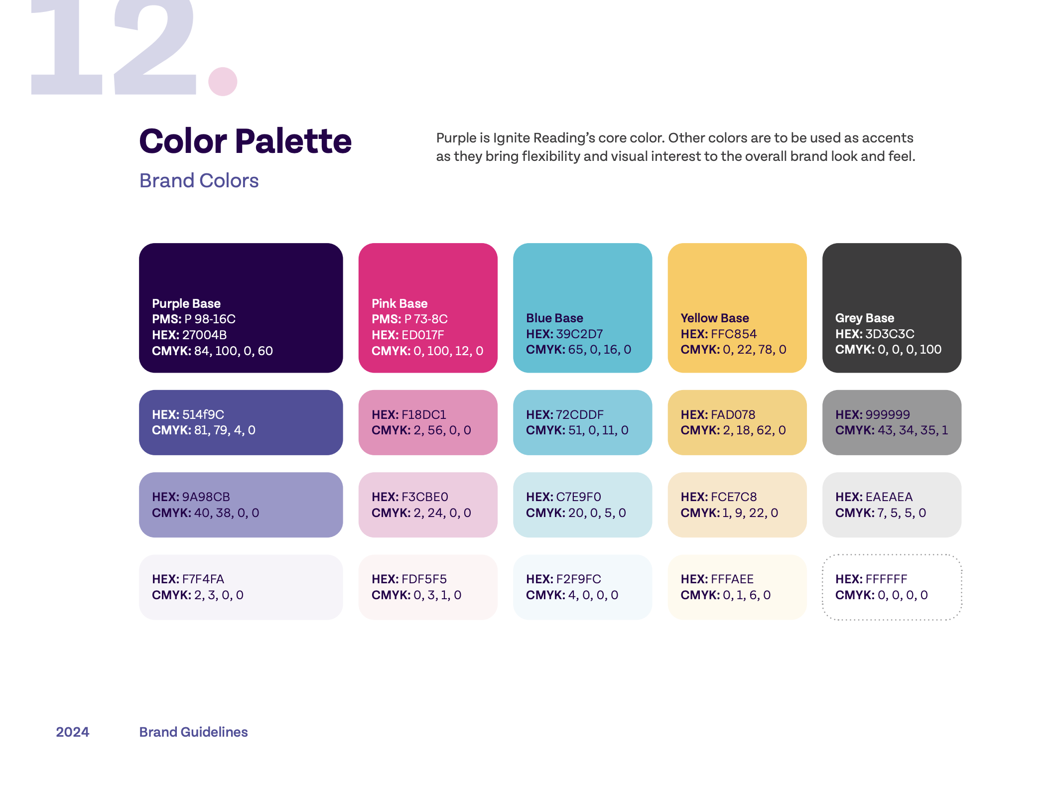
The new website homepage, designed by an external agency, served as the foundation for developing the brand guidelines and all other assets. The core brand colors—hot pink and purple—remained unchanged from the previous design.
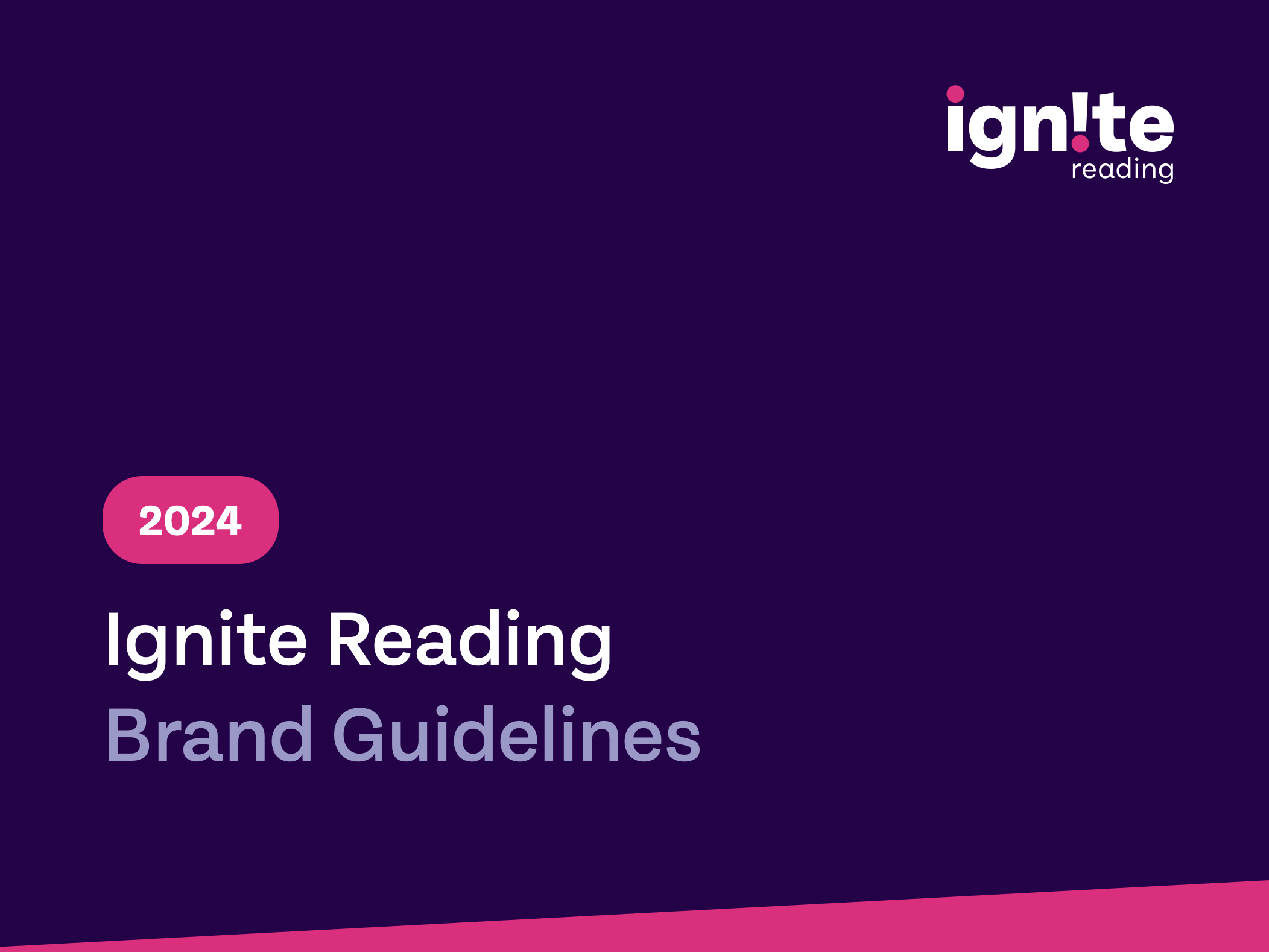
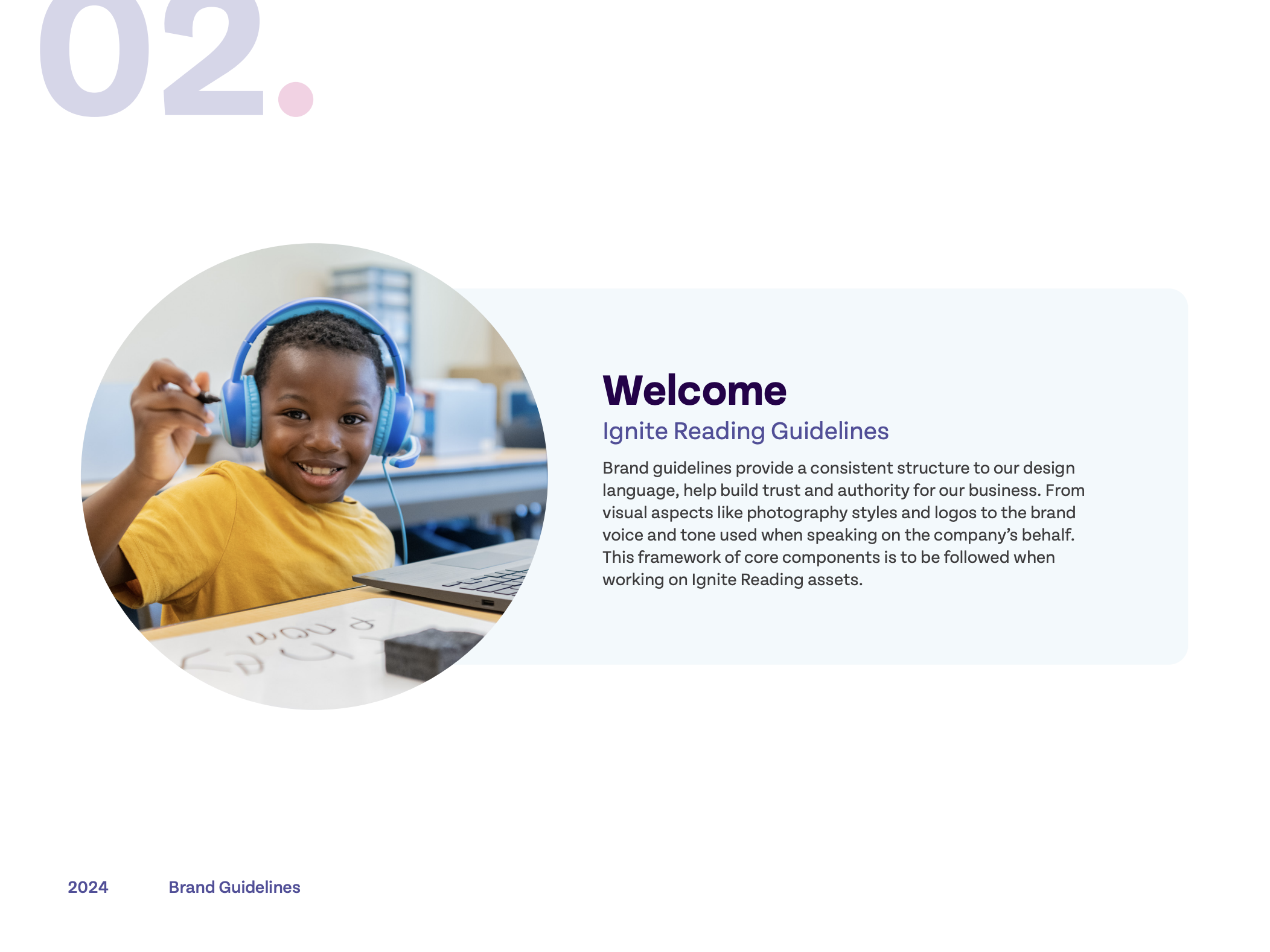
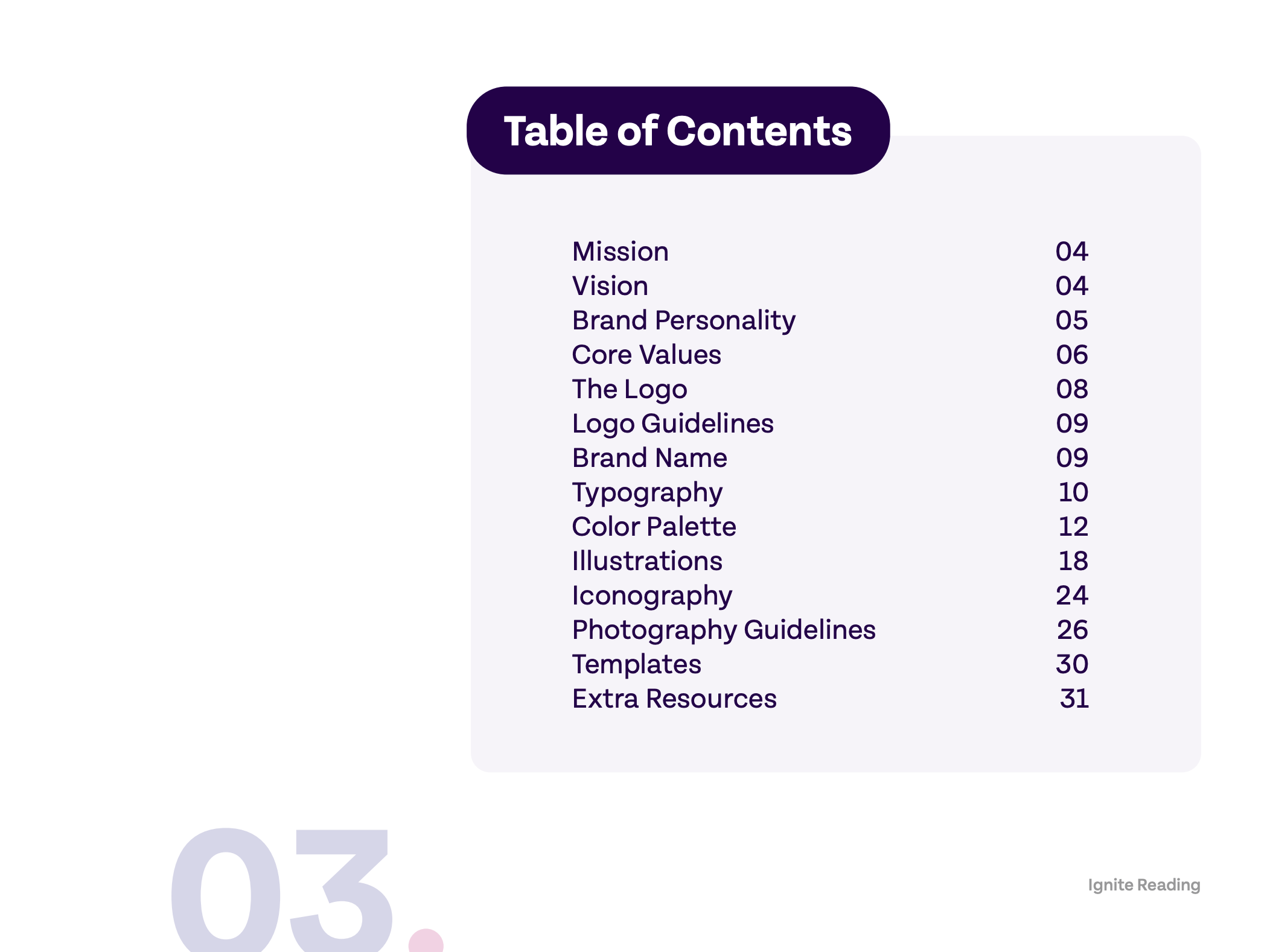
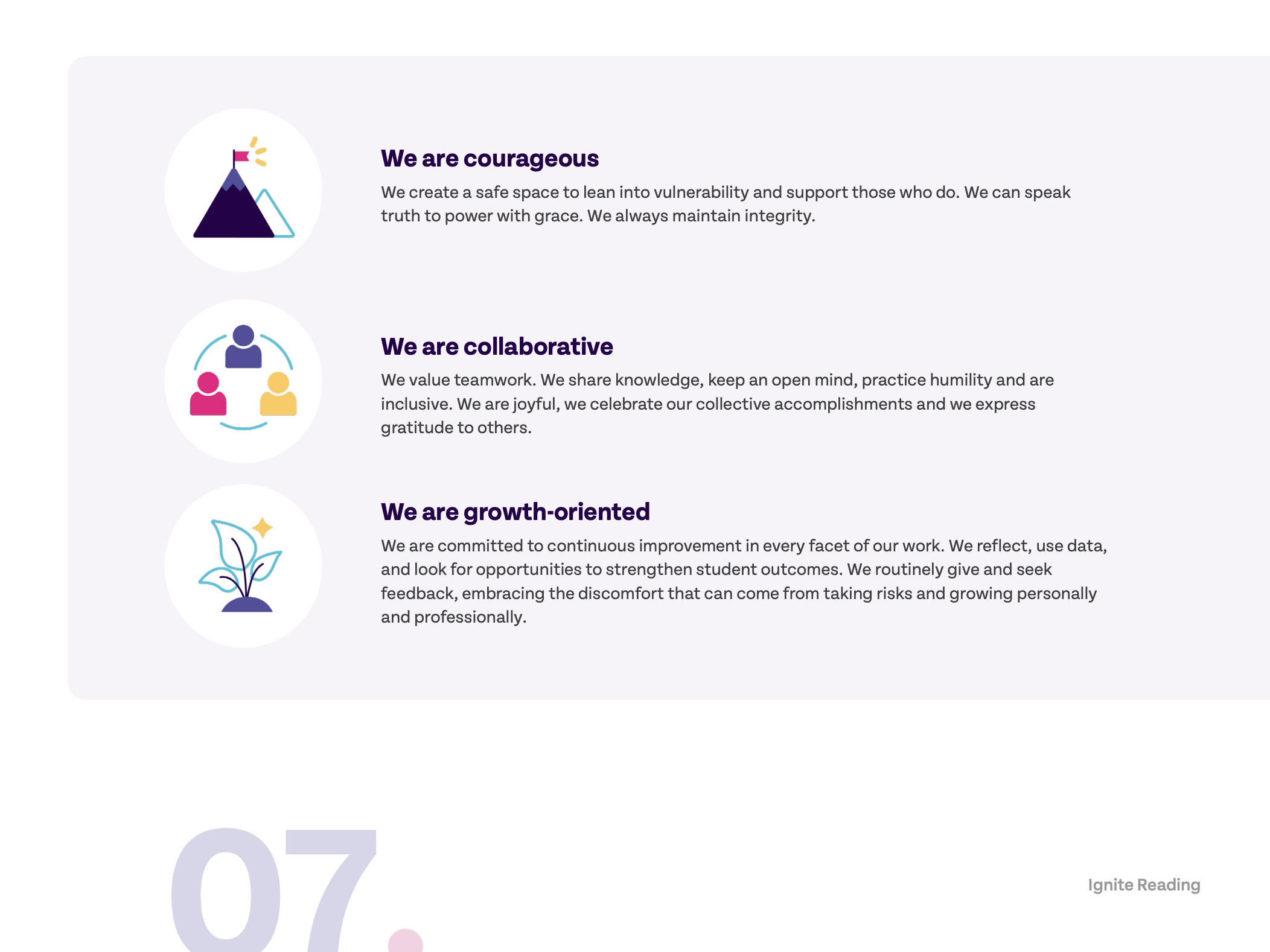
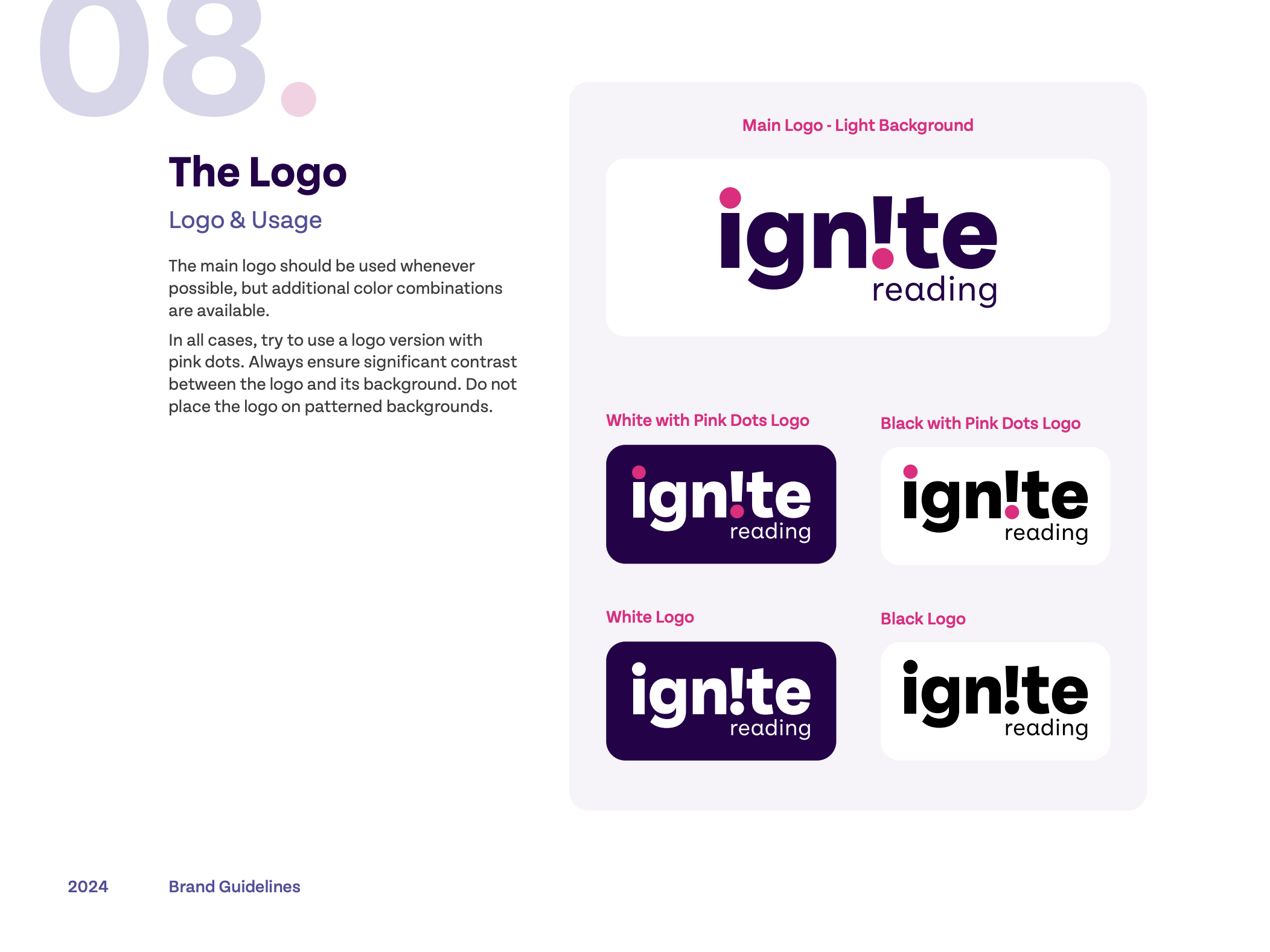
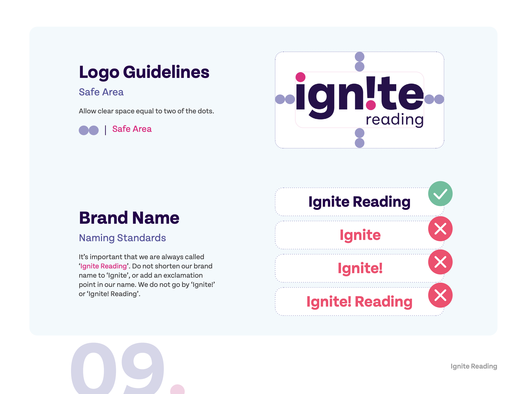
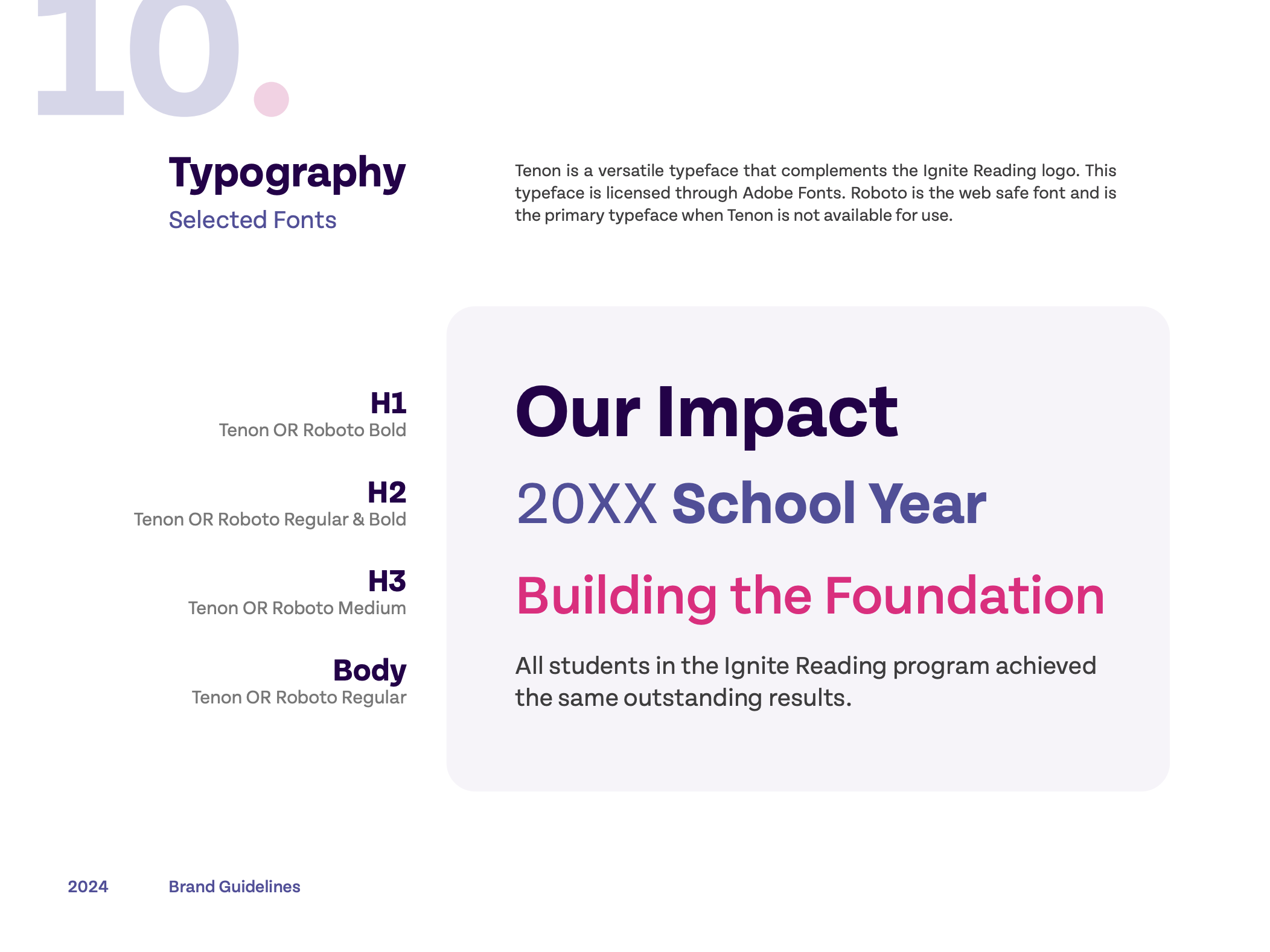
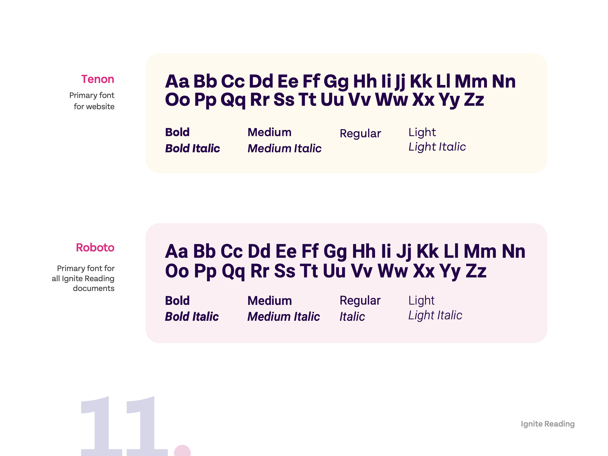
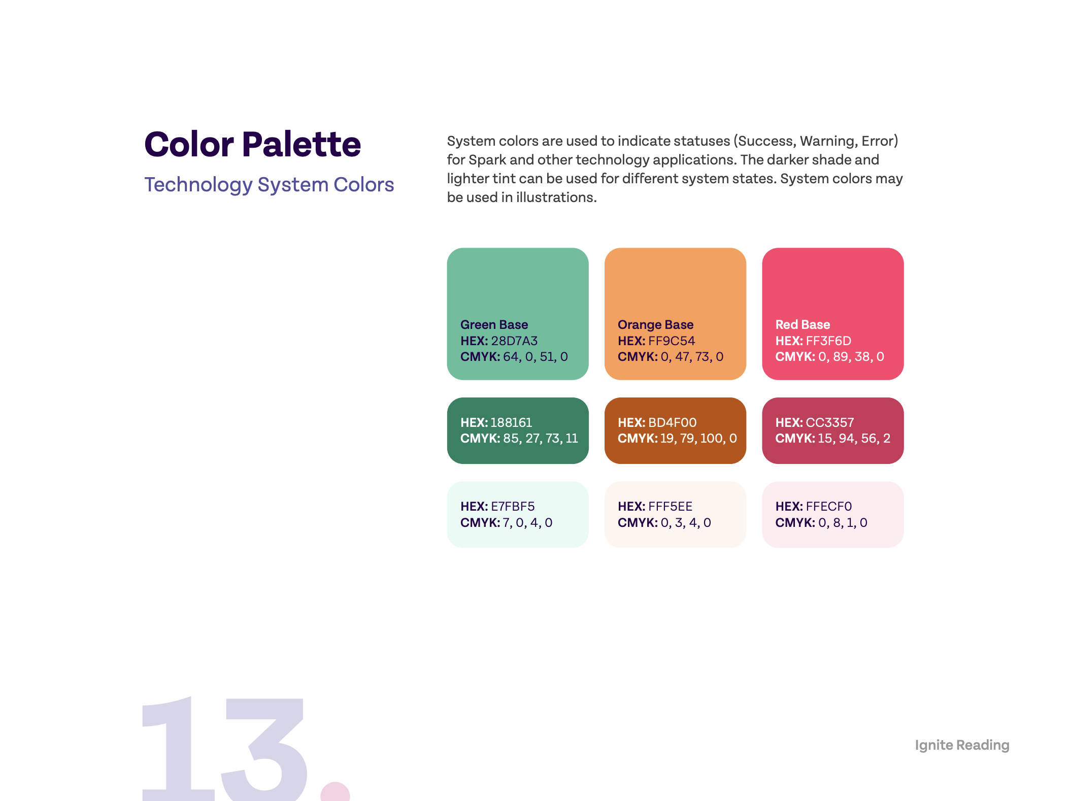
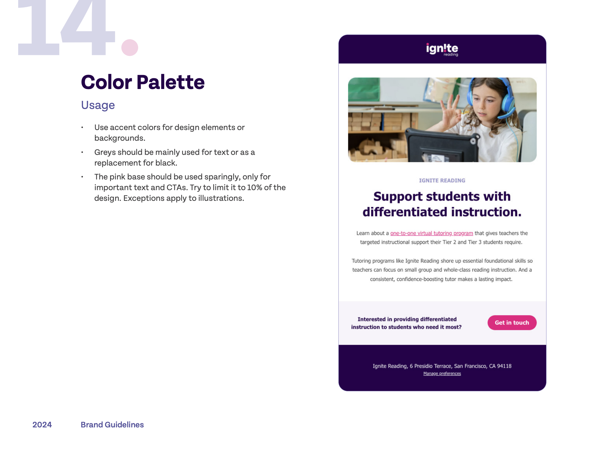
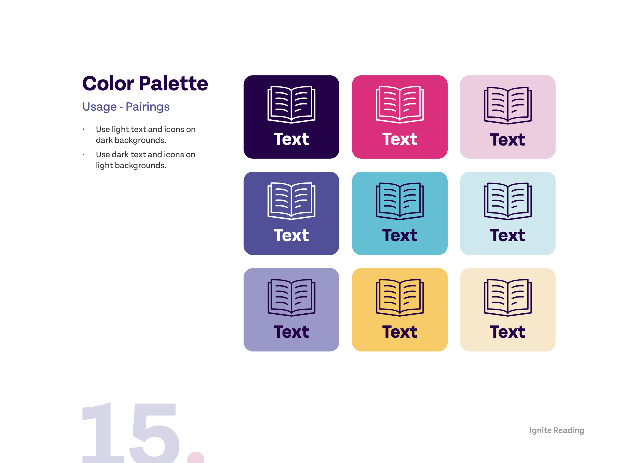
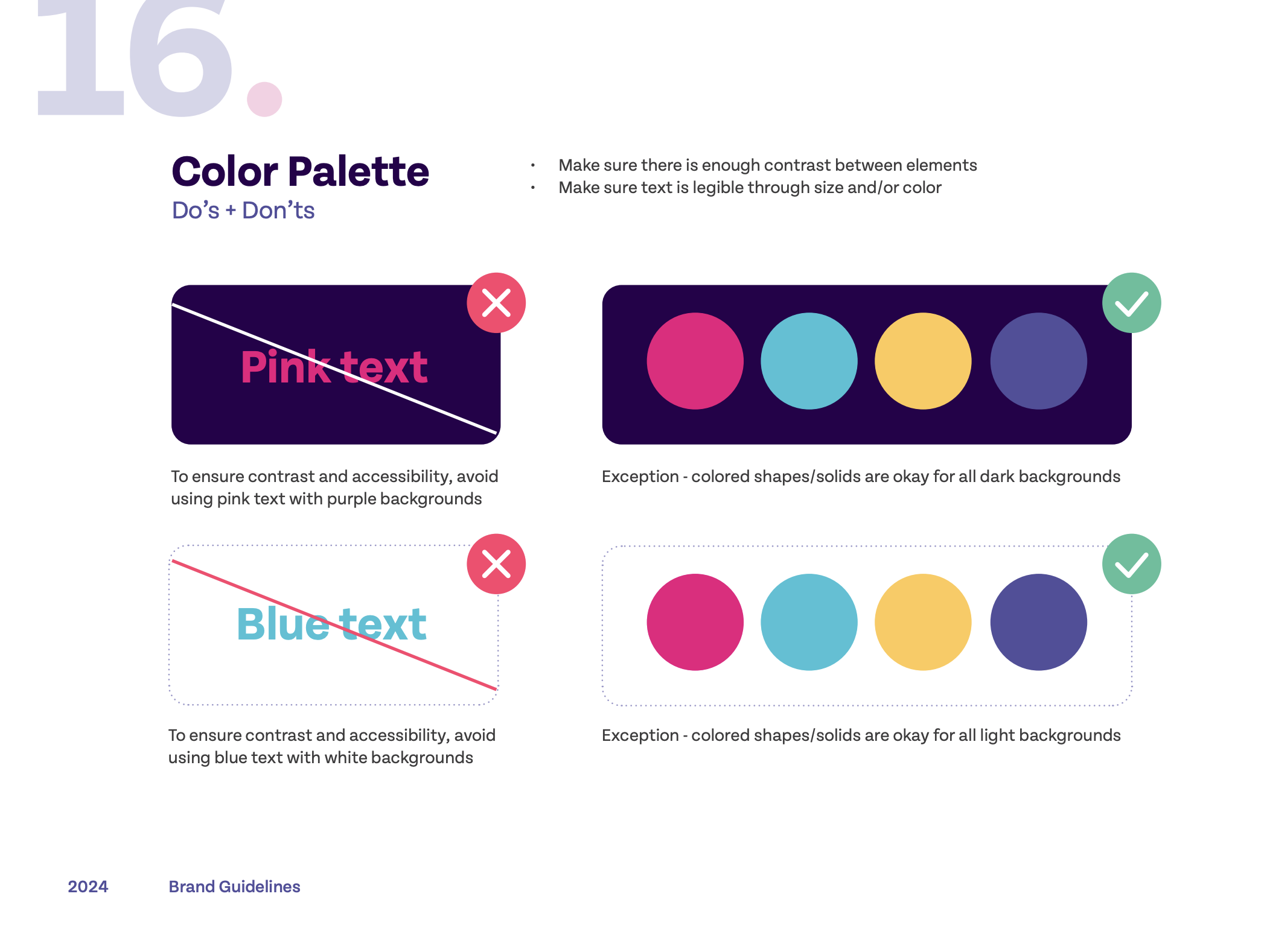
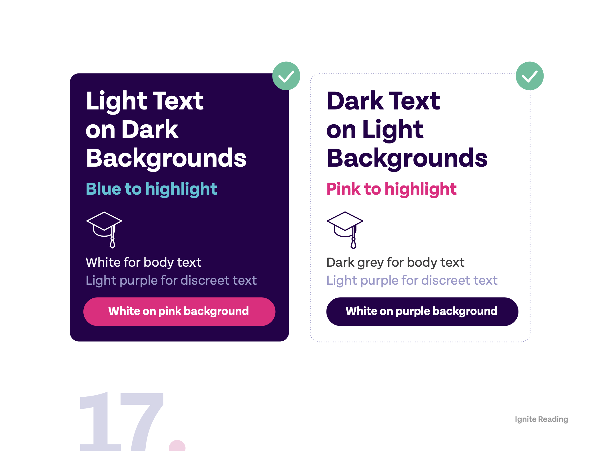
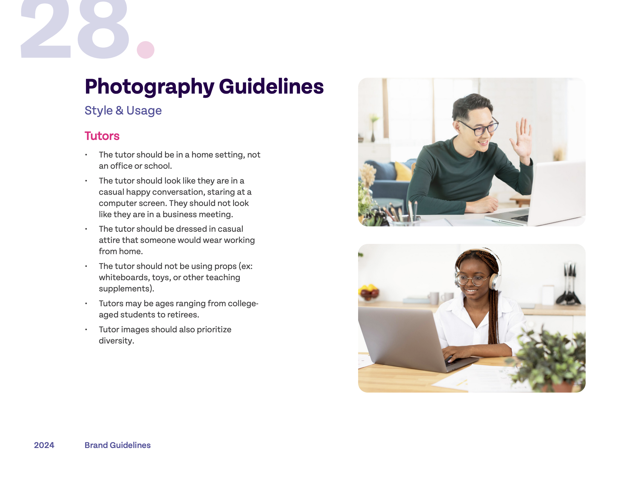
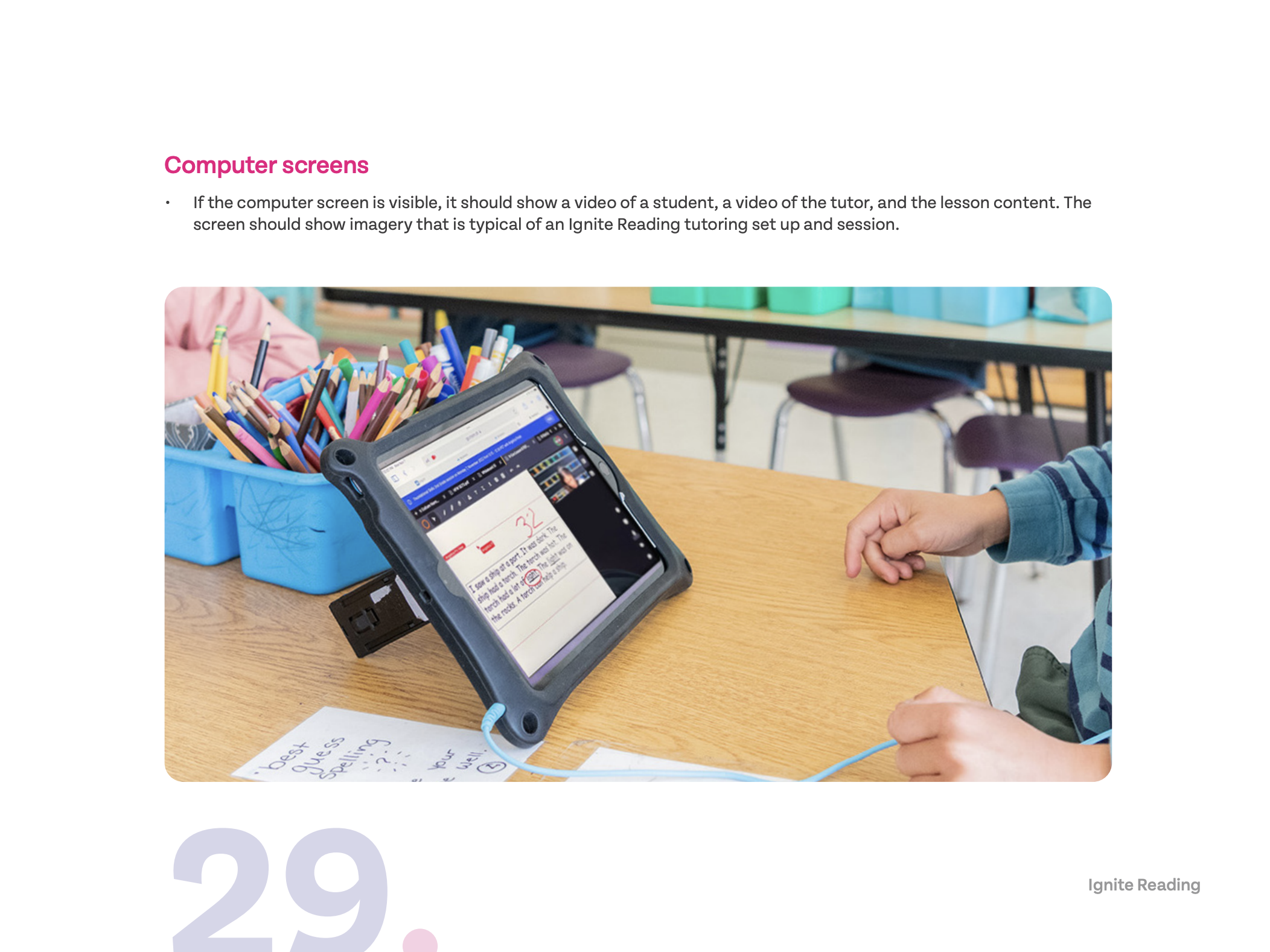
Brand Guidelines
Socials & Illustrations
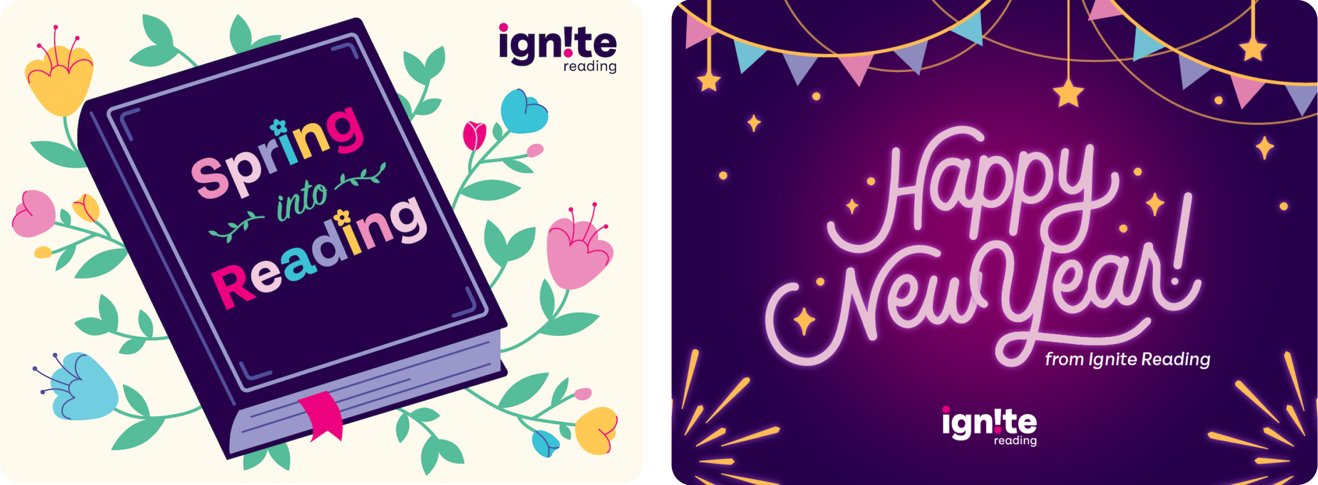
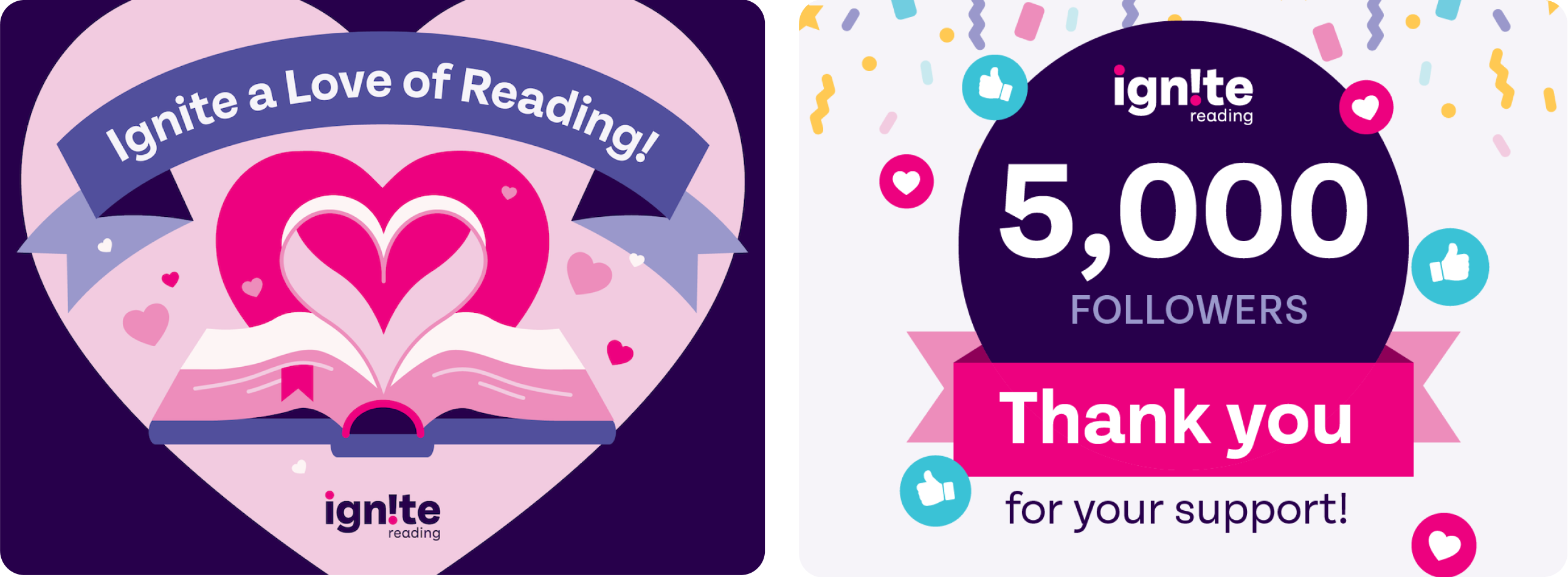
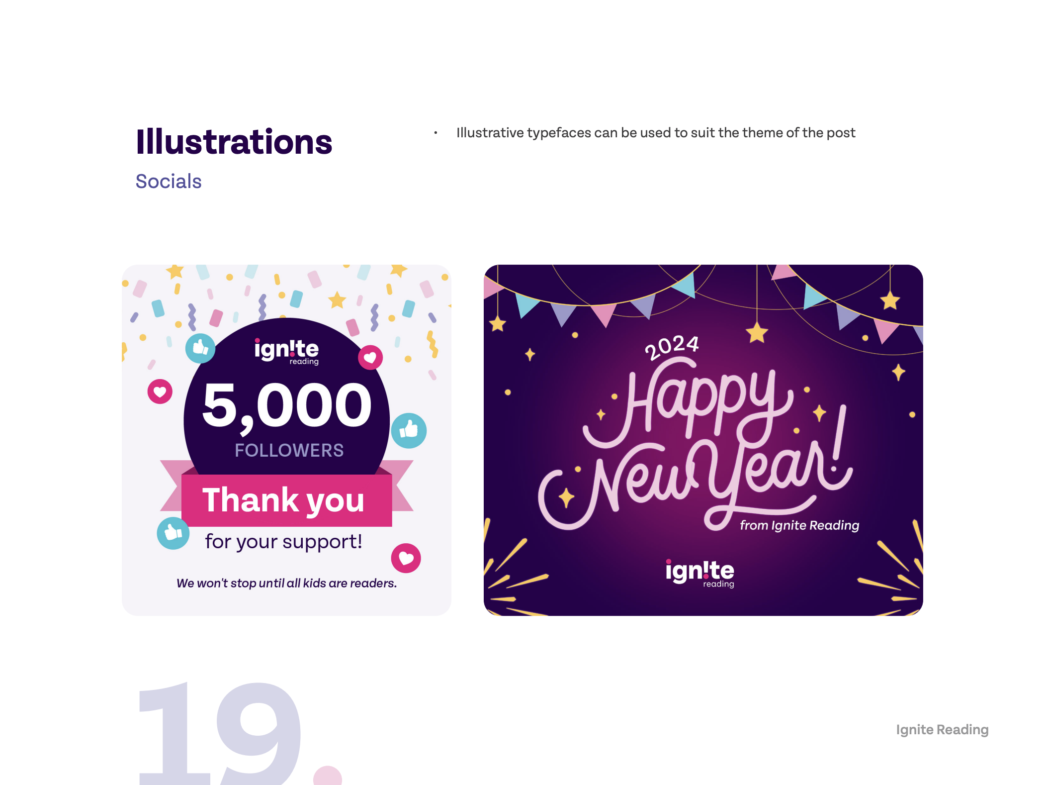
Socials
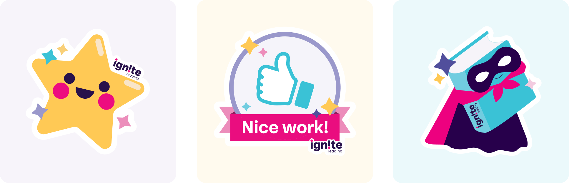
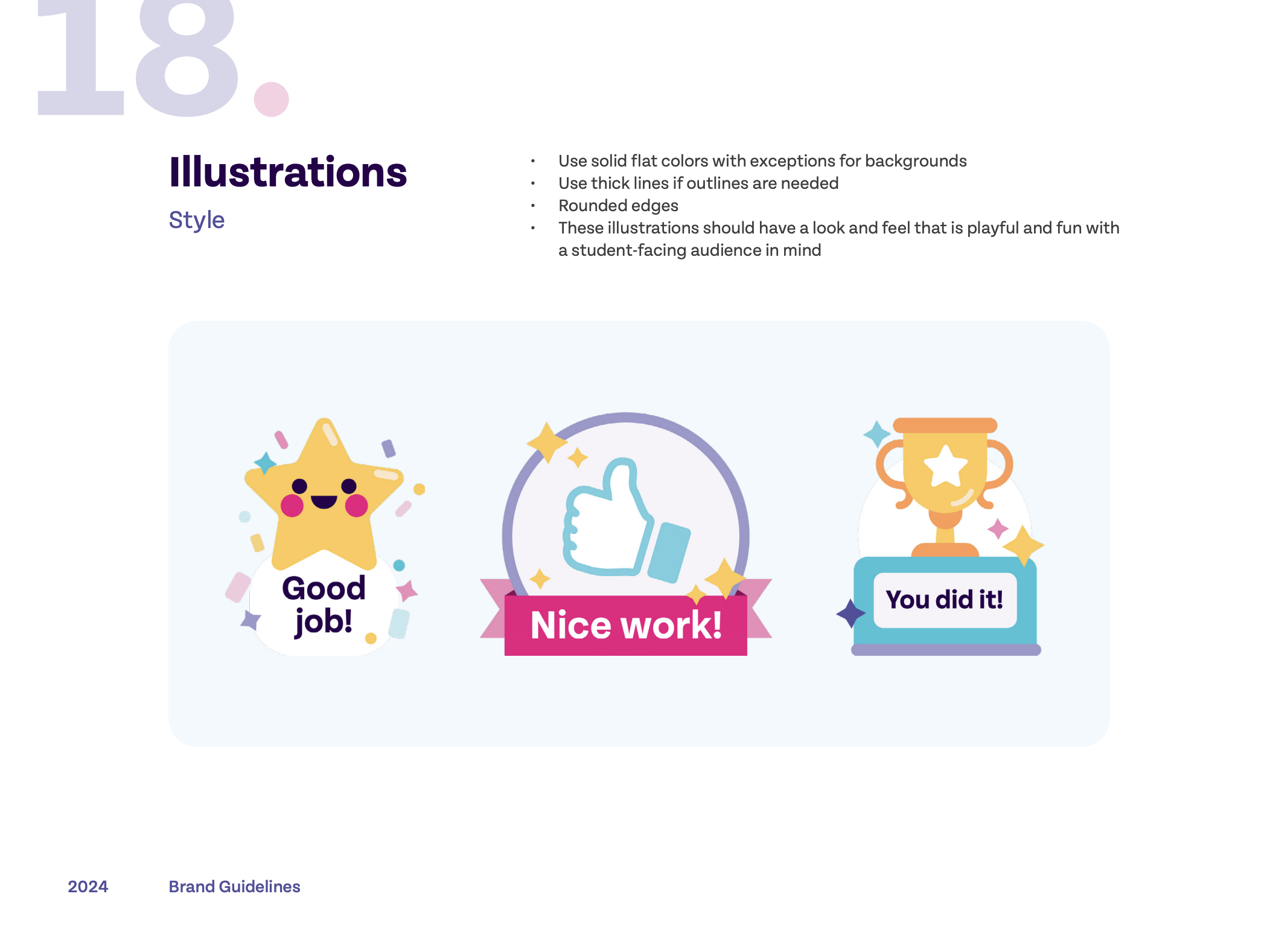
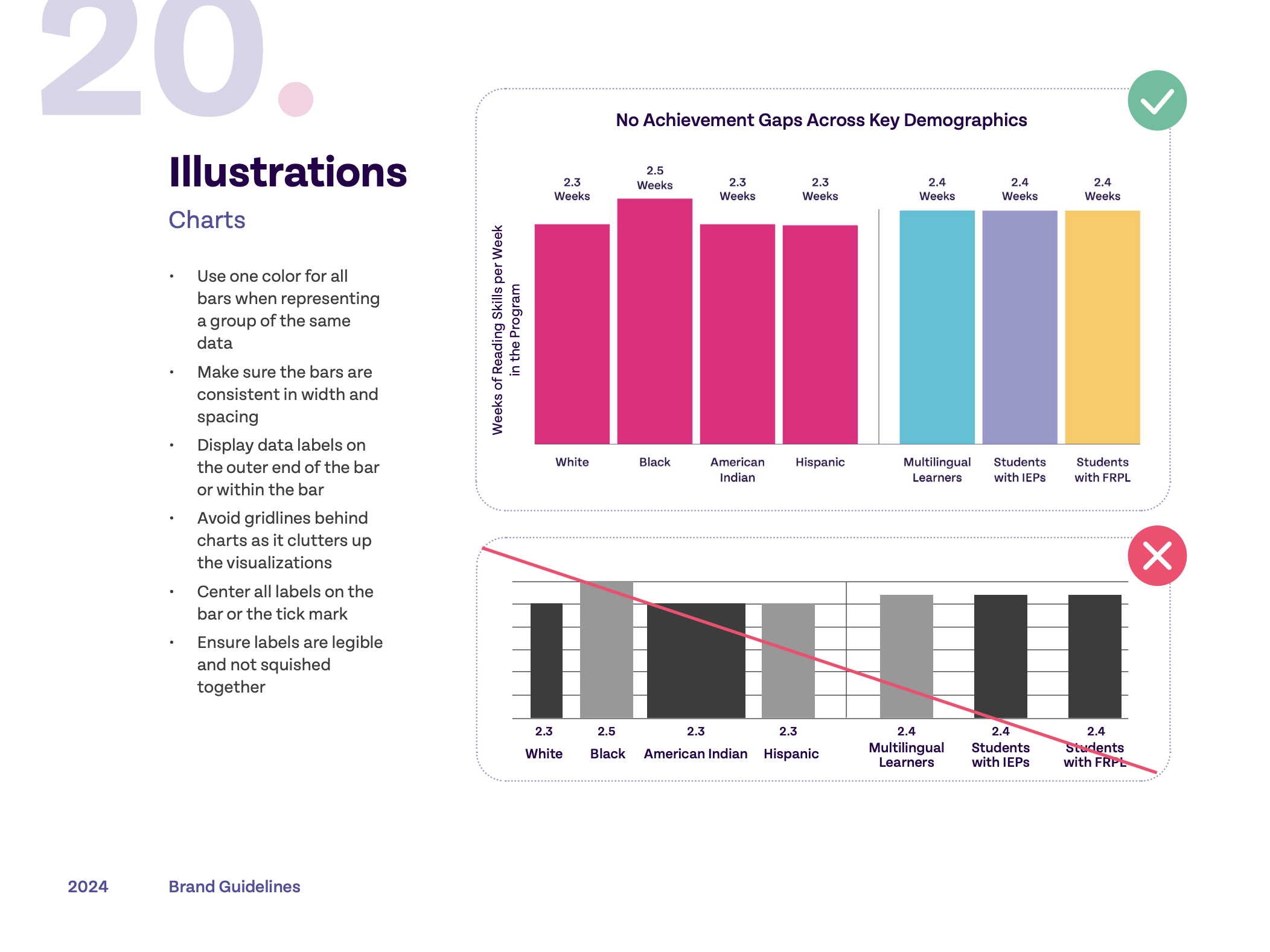
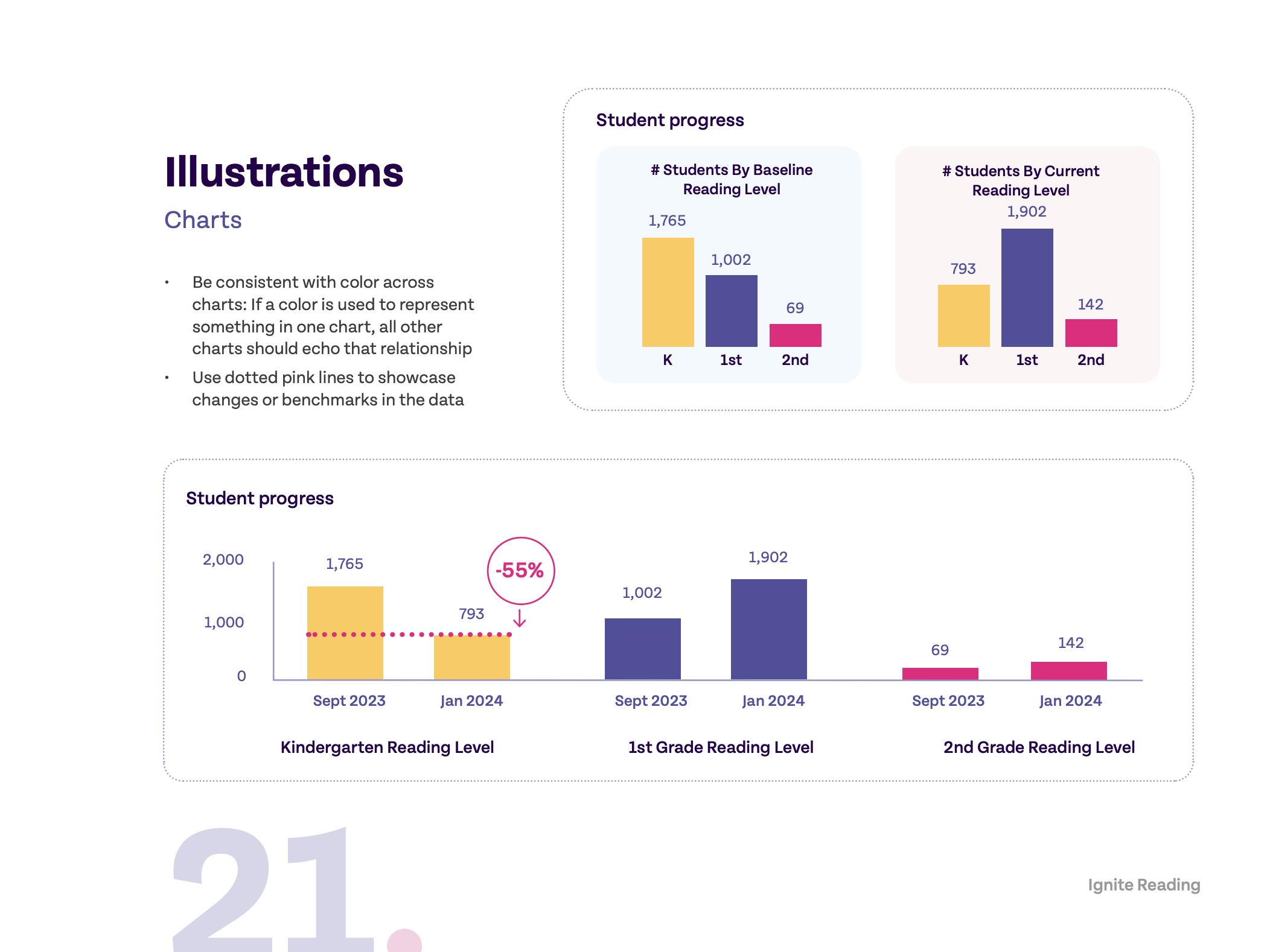
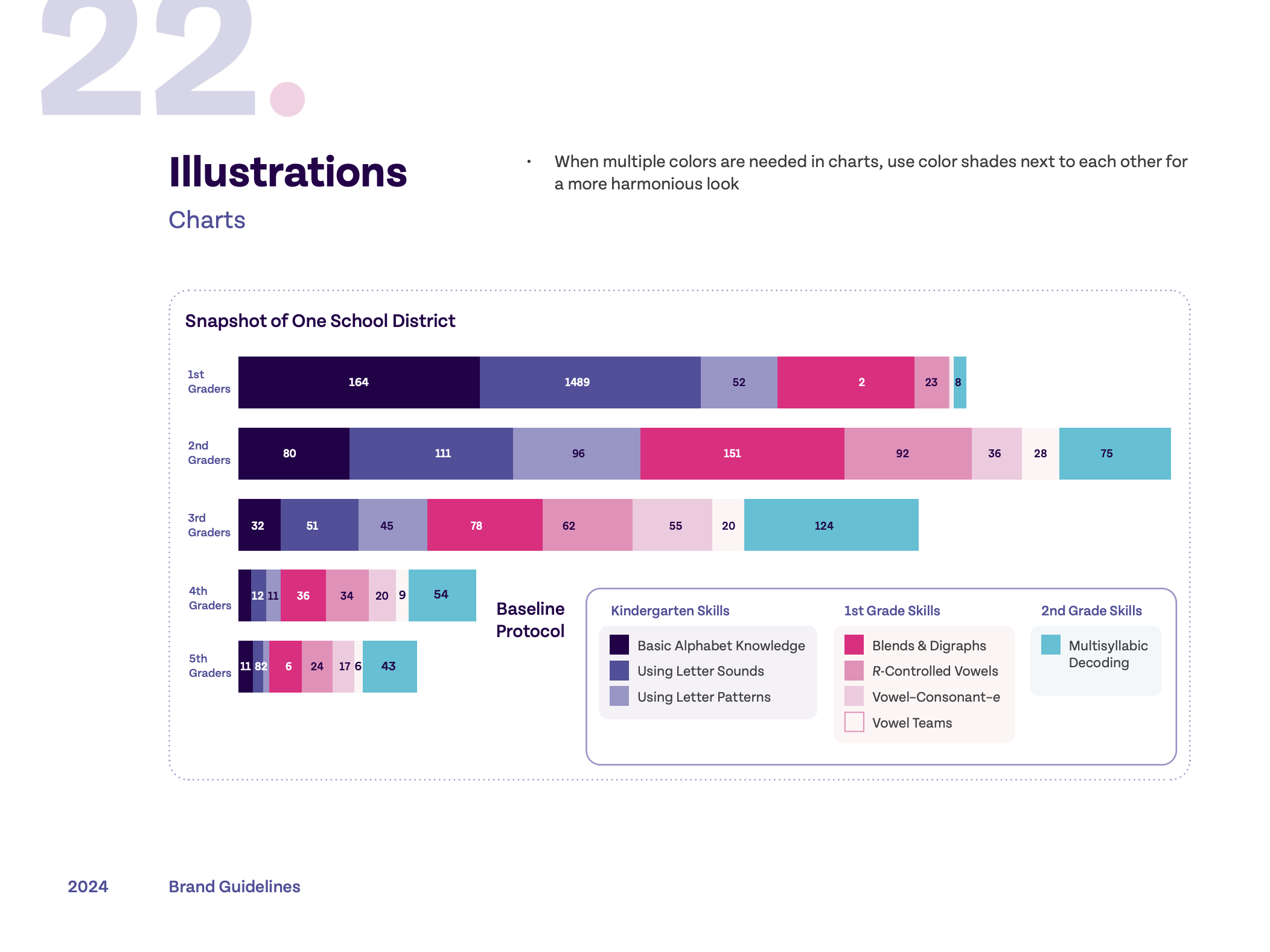
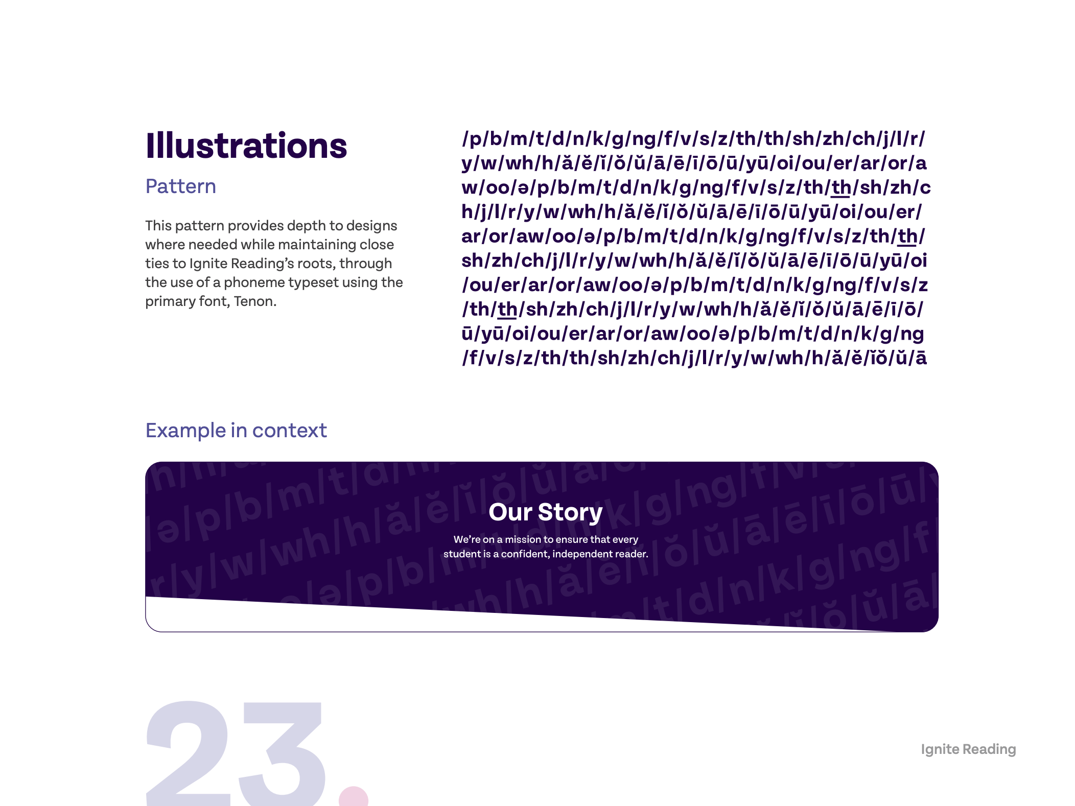
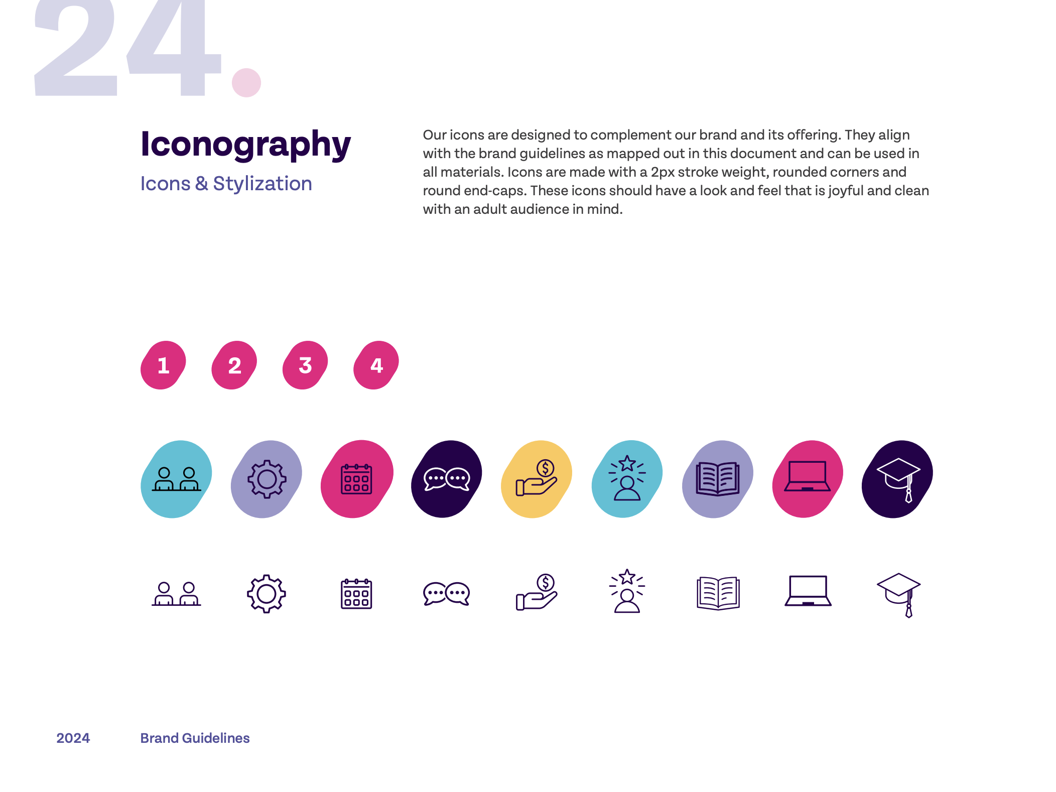
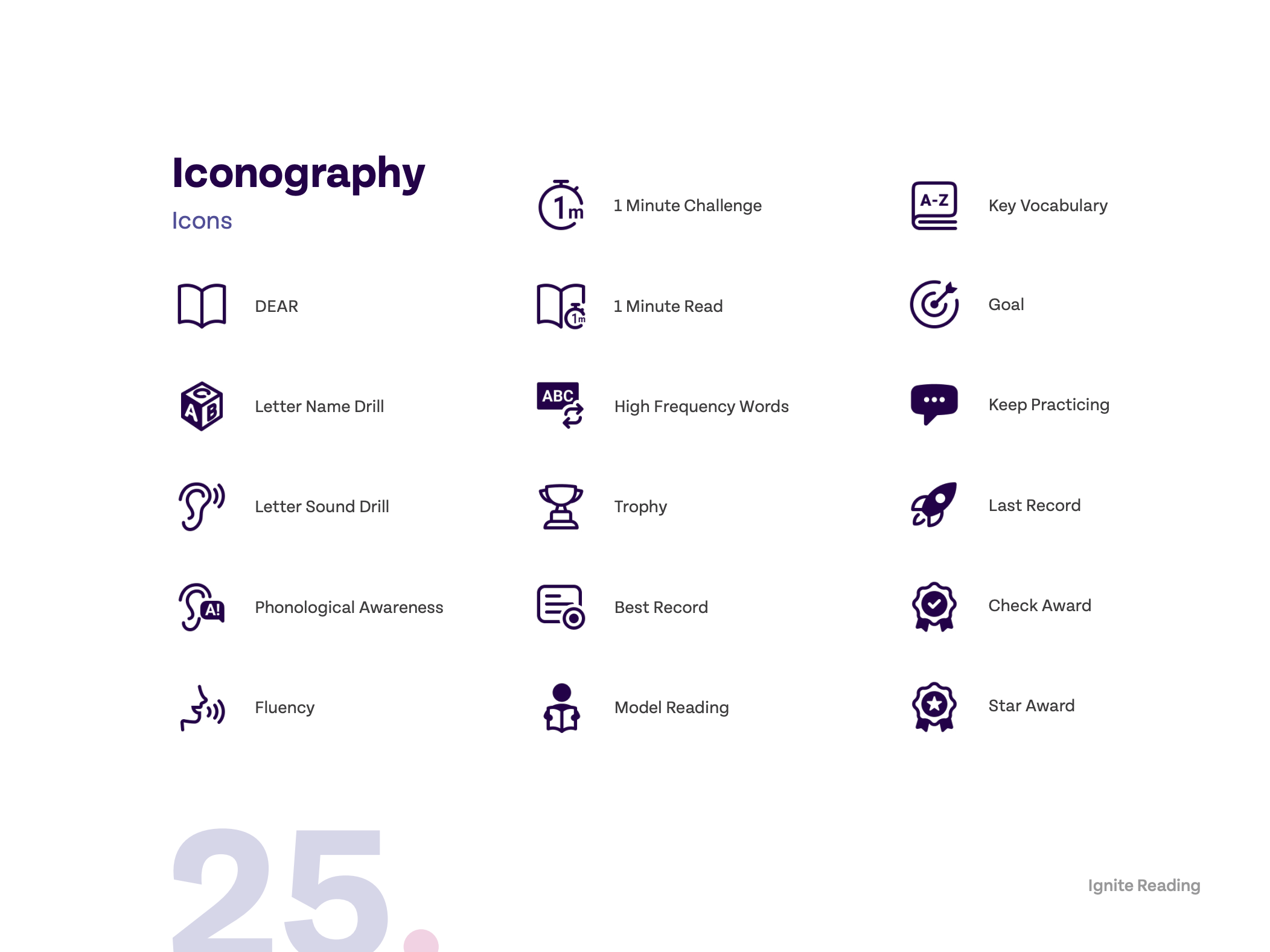
Illustrations
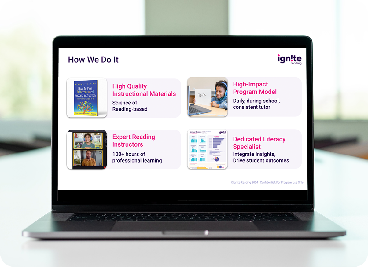
Slide Decks
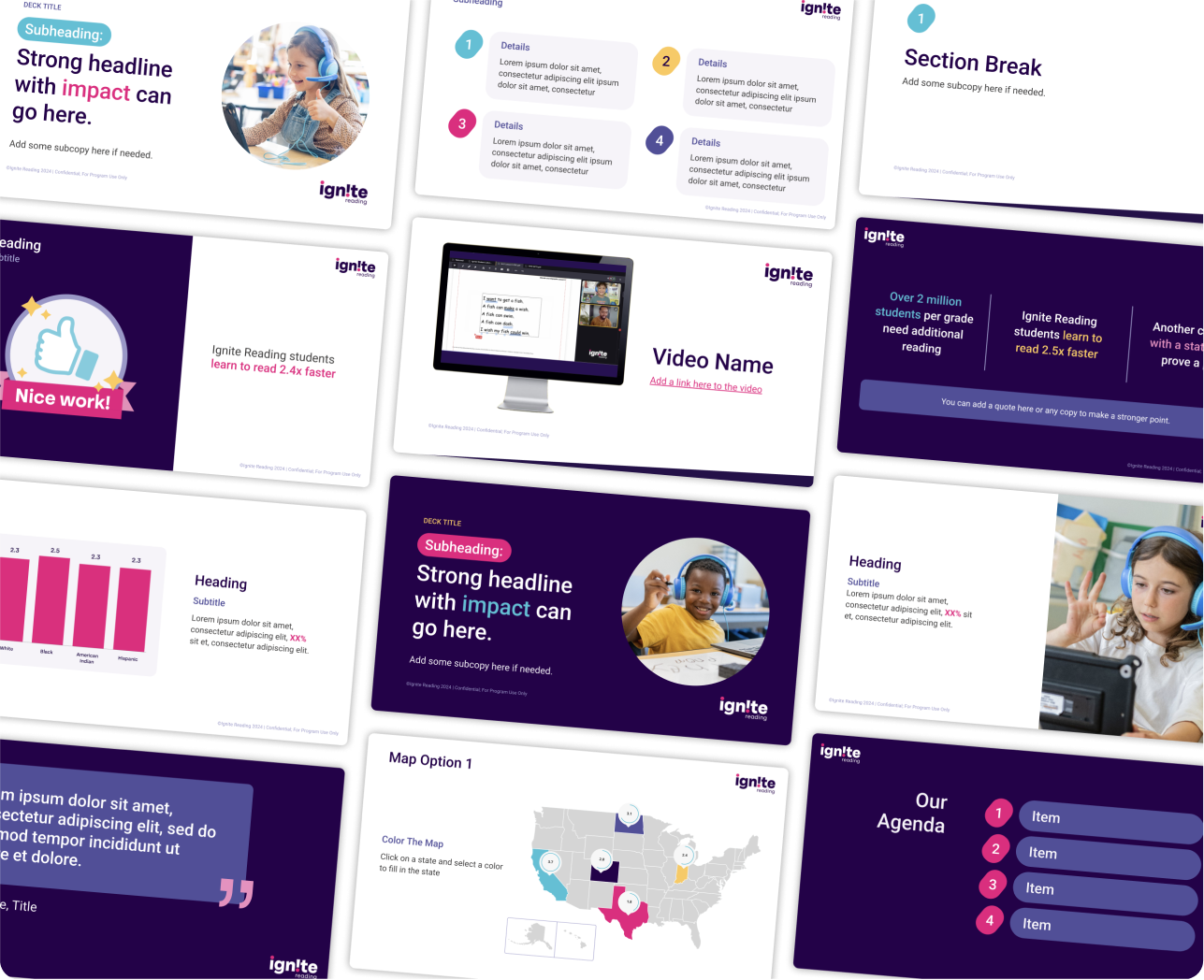
Google Slide Template
This Google Slides template was designed to bring a cohesive, professional look to our presentations—capturing our refreshed brand identity and empowering our team to communicate with structure, clarity, and purpose across both internal and external settings. Light and dark theme options offer added flexibility for different environments and preferences.
Web Page Design
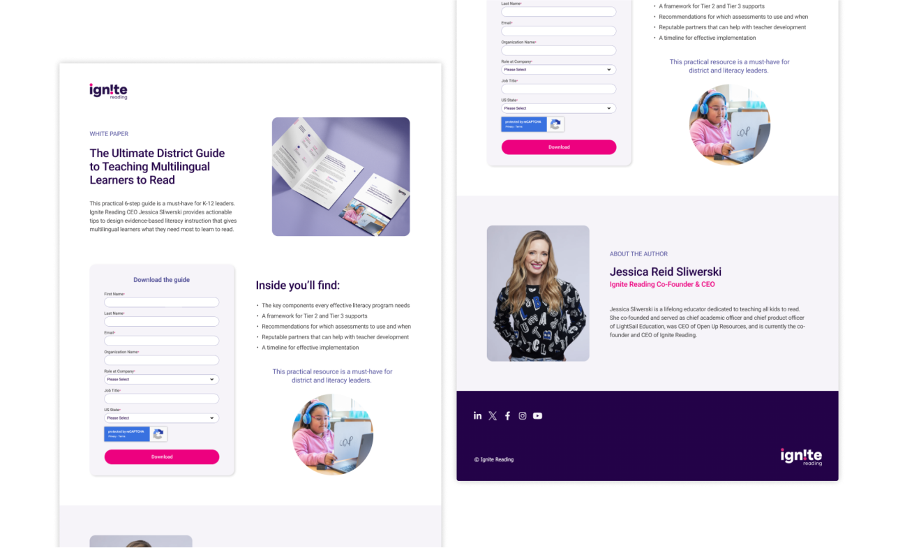
Gated Content Landing Page
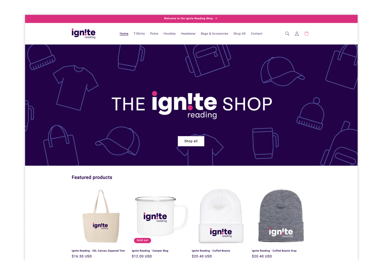
Company Branded SWAG Shop
Result
This project turned out to be a huge task, but a really rewarding one. I worked closely with all the teams at Ignite Reading to make sure everything was consistent and aligned with the brand’s mission and values. We ended up transforming a lot of systems, from design to communication, to make sure the brand really reflected who we are and what we stand for. It wasn’t just about a visual refresh—it was about making sure everything we do, inside and out, feels unified and on-brand. It was a great experience in team collaboration and really made me appreciate the importance of consistency when building a brand.