Company Materials — 2025
Ignite Reading
Ignite Reading is a one-to-one virtual literacy tutoring program designed to address early reading skill gaps in young learners through high-dosage, individualized instruction.
Tools: Adobe CC, Figma
About
For the Ignite Reading rebrand, we created a full suite of documents, marketing materials, and sales tools to match the new mission and look. It was important that everything, from internal resources to public materials, stayed consistent with the new brand strategy we rolled out in 2023.
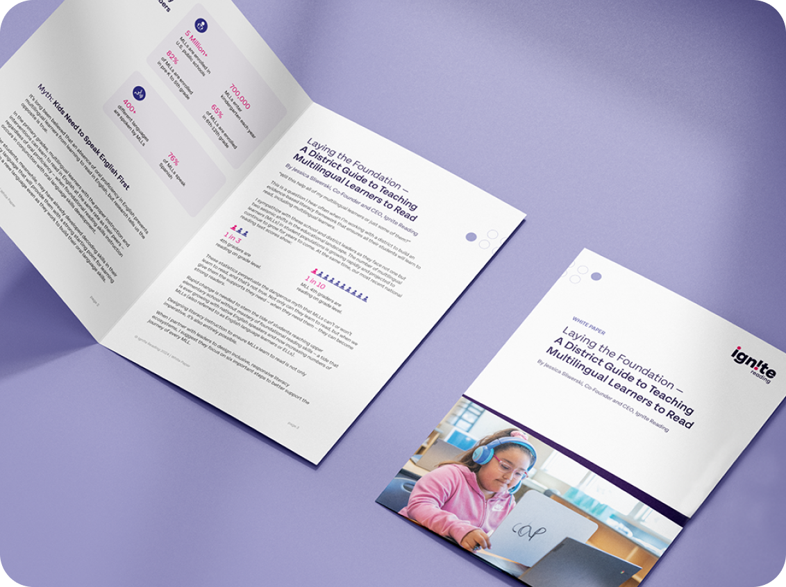
Print Material
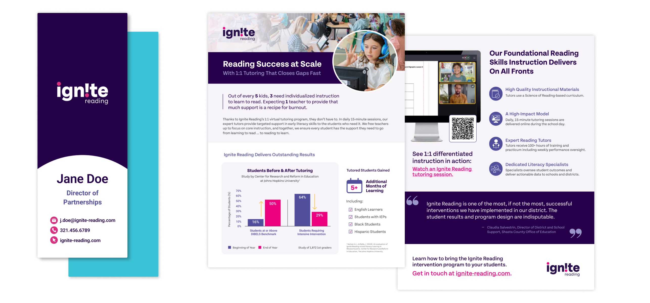
Business cards and one-pager
Sales materials were overhauled to create a cohesive, professional look that elevated every customer-facing touchpoint. To add a playful, on-brand element that tied into the company’s literacy-focused mission, we created bookmark-style business cards.
Event Booth Design
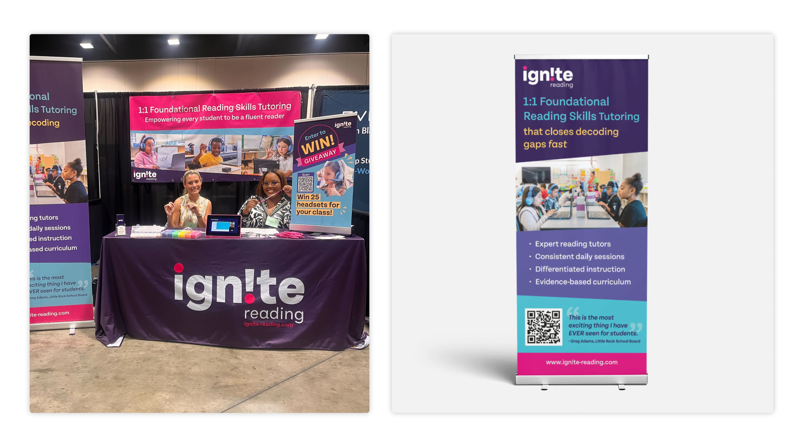
ADE Summit 2024 — Stand up banner, backdrop and table design
The goal was to create a booth that really stood out and grabbed people’s attention. With bold graphics, clear messaging, and interactive elements, it helped showcase the brand’s values while sparking great conversations. We had a fun giveaway and a station where attendees could make their own friendship bracelets. This was designed with usability in mind for other conferences.
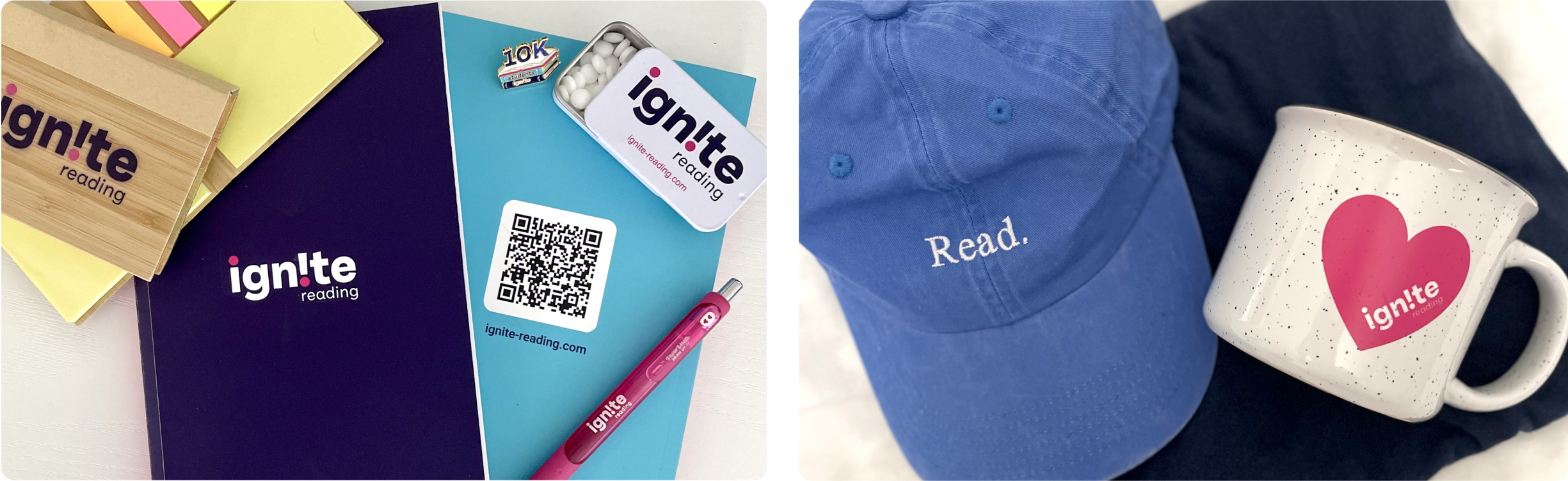
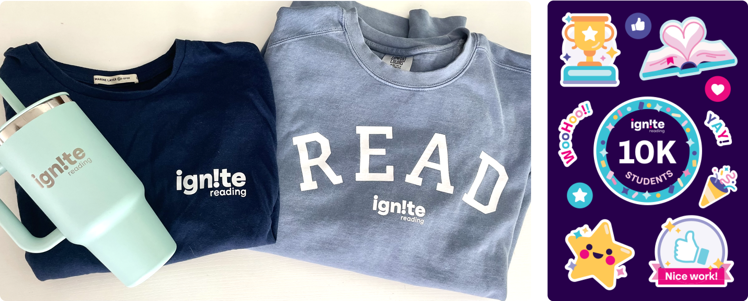
Company Branded Gear
As part of our brand-building efforts, I led the design and vendor sourcing for company-branded gear that fostered team identity and supported our growing startup culture. From apparel and stickers to off-site retreat materials, every item was intentionally crafted to reflect our mission and values. The result was a cohesive collection that employees genuinely appreciated—boosting morale, reinforcing unity, and bringing the brand to life from within.
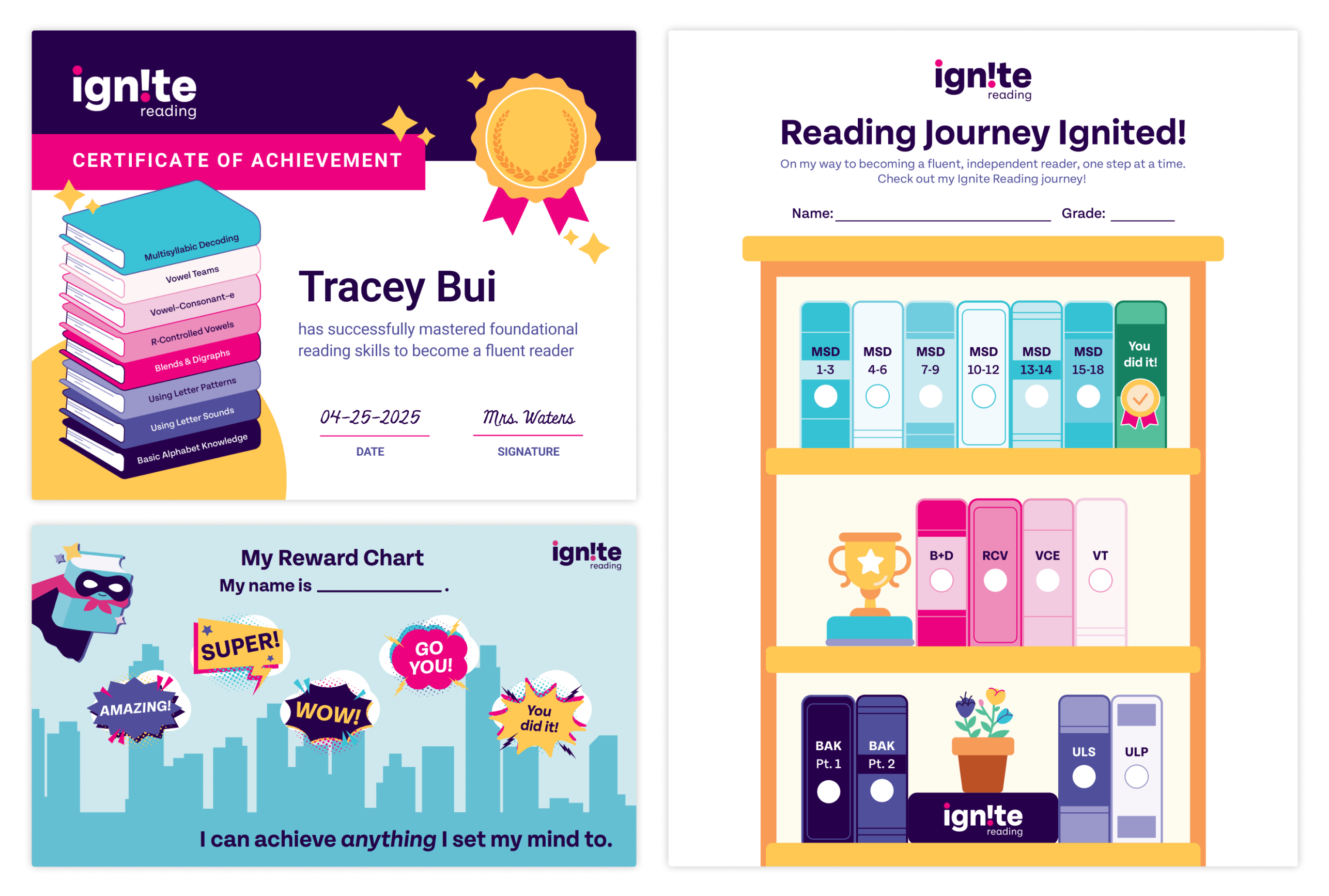
Tutor Resources
The tutor-facing side of the company played a big role in bringing our visual identity to life. Before, most tutor resources used free materials and clip art, which lacked cohesion. By creating our own branded resources, we reinforced our identity and ensured a consistent connection to the brand, leaving a stronger impression on students, parents, schools, and tutors. We also emphasized our curriculum journey through a thoughtful color system to represent different levels, while incorporating book imagery to tie everything back to our literacy theme. The introduction of our playful illustrations were brought in as well.
Result
I teamed up with sales, marketing, and people operations to give the brand a fun, vibrant makeover that really reflects the company’s culture. It was a blast bringing this vision to life, and it felt great to be able to infuse some personality into everything we created. The end result not only stood out internally but also helped set us apart from the competition, making a memorable impact both in-house and out in the market.