UX/UI Design — 2023
LiveReach AI
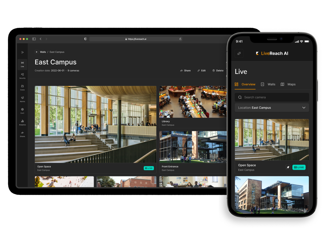
LiveReach AI is a video intelligence and cloud-based platform designed for analytics and security.
Tools: Figma
About
LiveReach AI (LR AI) is a cloud-based B2B physical security platform company. LiveReach AI gives organizations the real-time insight to security risks, workplace frustrations and costly inefficiencies. Designing in collaboration with engineers, I was responsible for identifying issues, creating new flows and iterating on their UI screens based on client needs and requirements.
Change
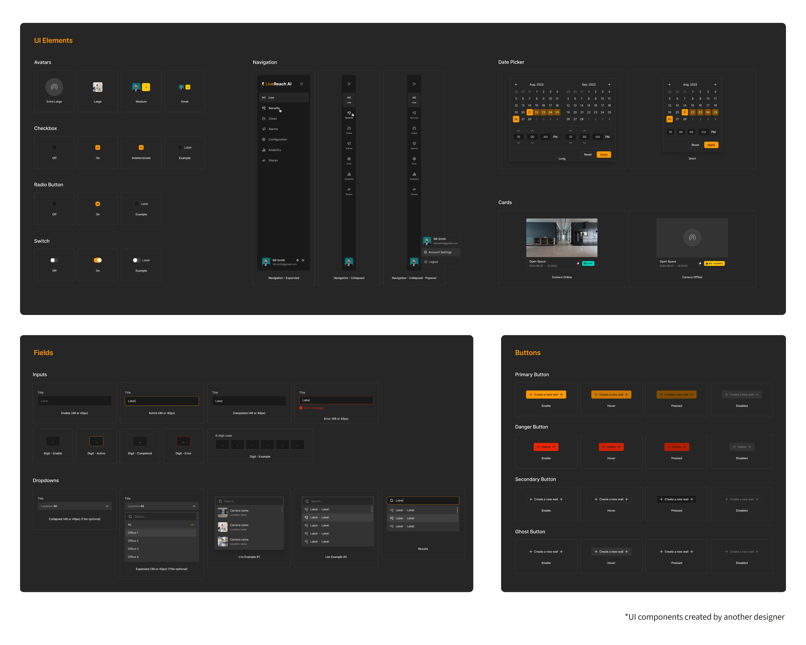
To match the rebrand, we needed to upgrade the old, outdated and unfriendly UI. LiveReach AI outsourced the core design system for the new software UI to produce a faster turnaround time while the rest of the rebrand was being implemented in other areas. That was then handed off in-house to use those elements to build out complete pages and more components.
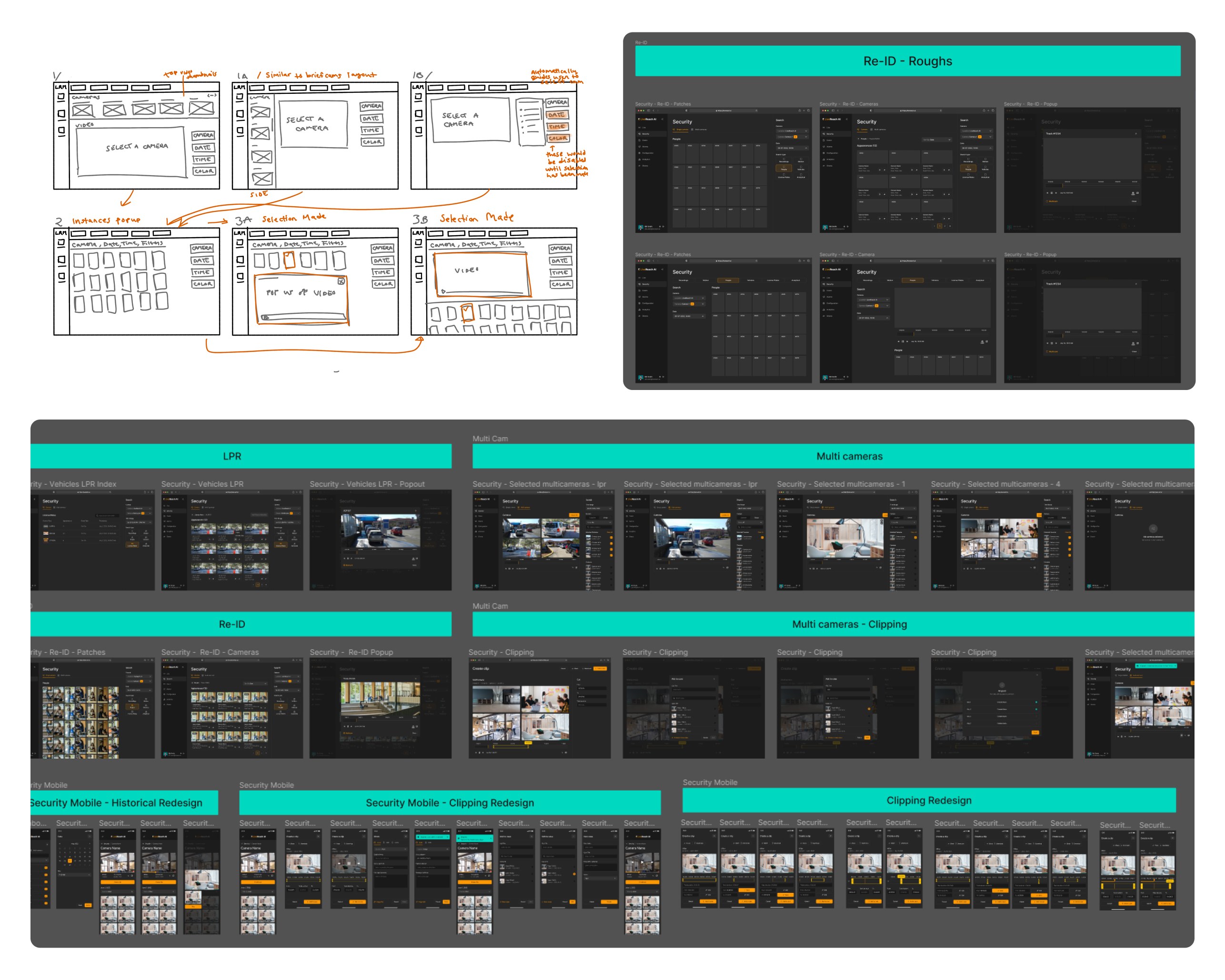
With new features and the need for simplicity and scalability in mind, the task at hand was to redesign the information architecture, layout, and user flow of their dashboard software. Then transfer the improved information architecture and layout to high-fidelity mockups using the new design system. This was quite a large task at hand for myself as a single designer. The intial UI design guide provided a great base to be able to iterate on and keep consistency for any new additional icons and components. This was a huge learning experience on building a unified design system, responsive design and analyzing the necessary functionality of each screen.
Process
New Screens
Below are a few of the features I worked on during my time at LiveReach AI.
Security
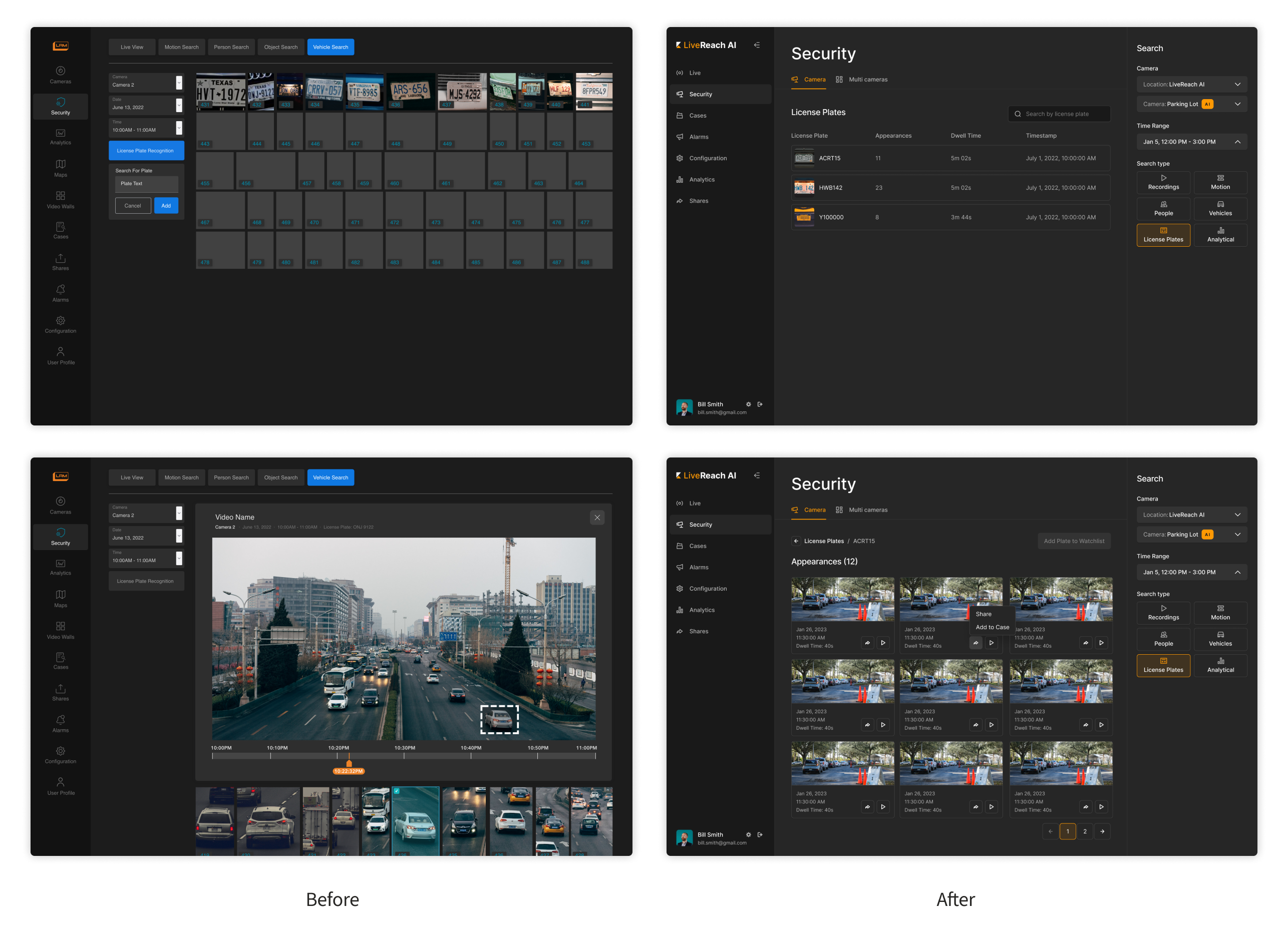
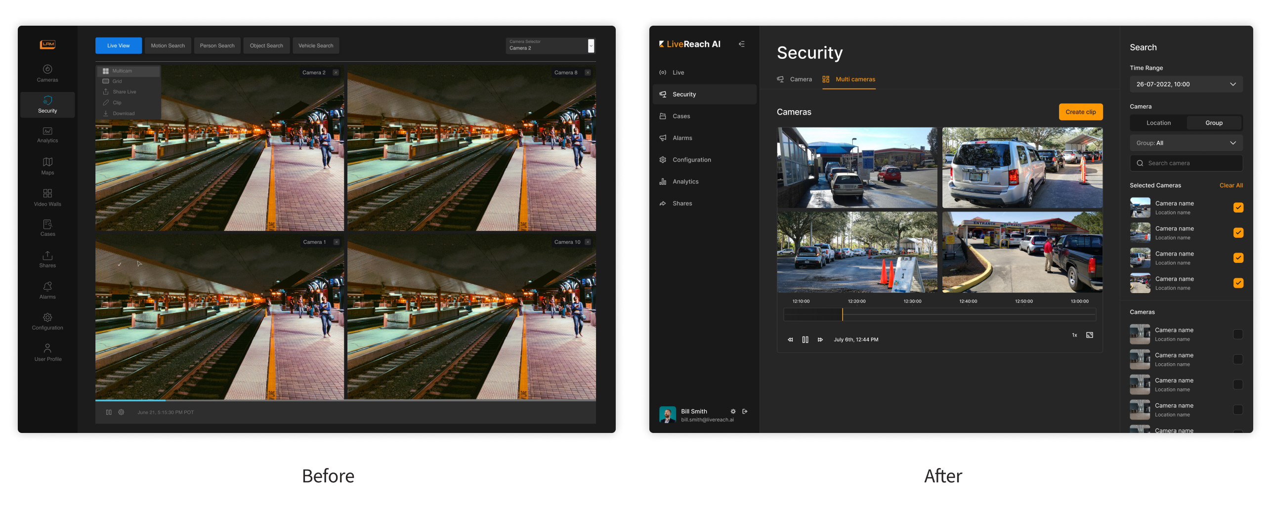
One of the biggest features that was changed in the platform was the camera security page. Search functions of this page were cleaned up and organized with a side menu so users could have an easier time viewing and changing their options. This was also made to accommodate to LiveReach AI’s ever-growing product offerings with multiple search types.
Multi Cameras
Users were struggling to see what cameras they could add to a multi-camera view. Adding in features to search by location, camera groups or name improved efficiency. The addition of small thumbnails to camera names formatted in a list helped users to easily visualize their selections.
Analytics
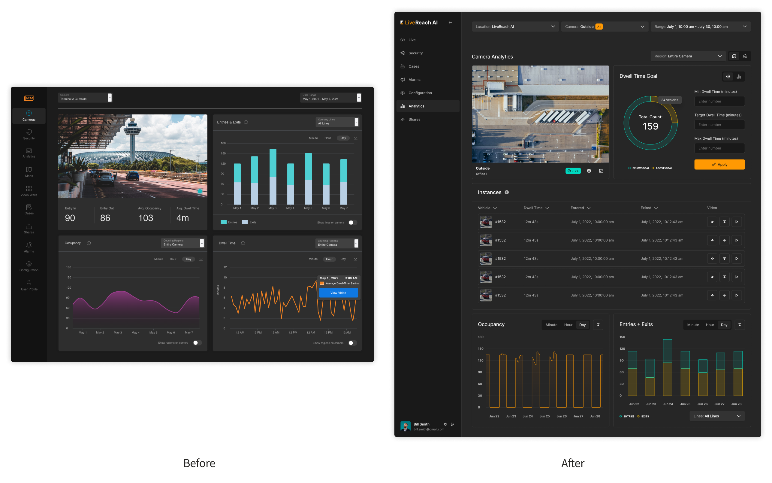
The problems with this screen were that changes to each analytic card needed to be done on an individual level. Adding selections and tabs to easily switch between different options allowed users to see results on a high level.
Cases
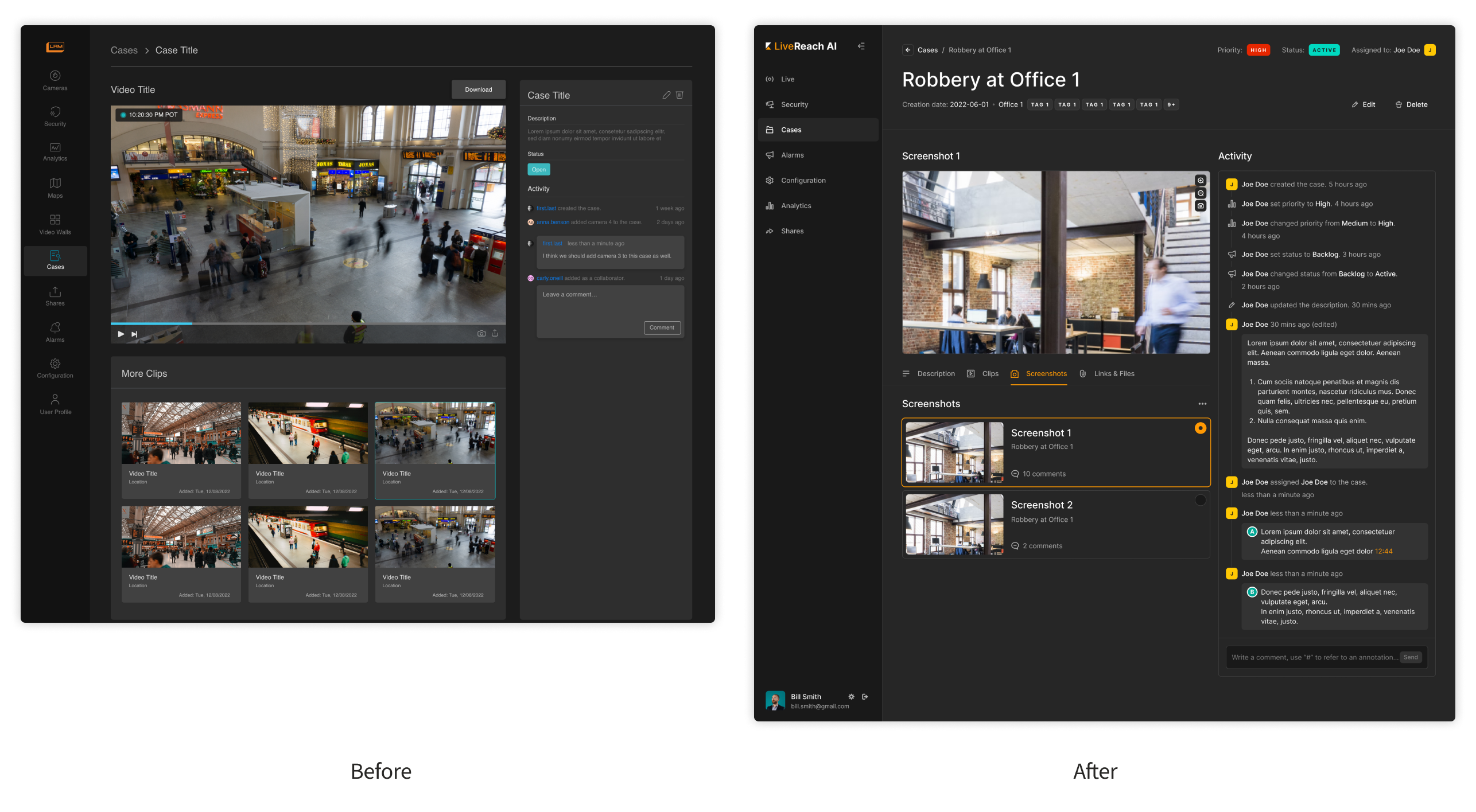
The amount of information needed to be added in their case screen increased. Utilizing a tab system, users can now easily see added attachments. A tagging system was also implemented to easily sort case priority and status.
Result
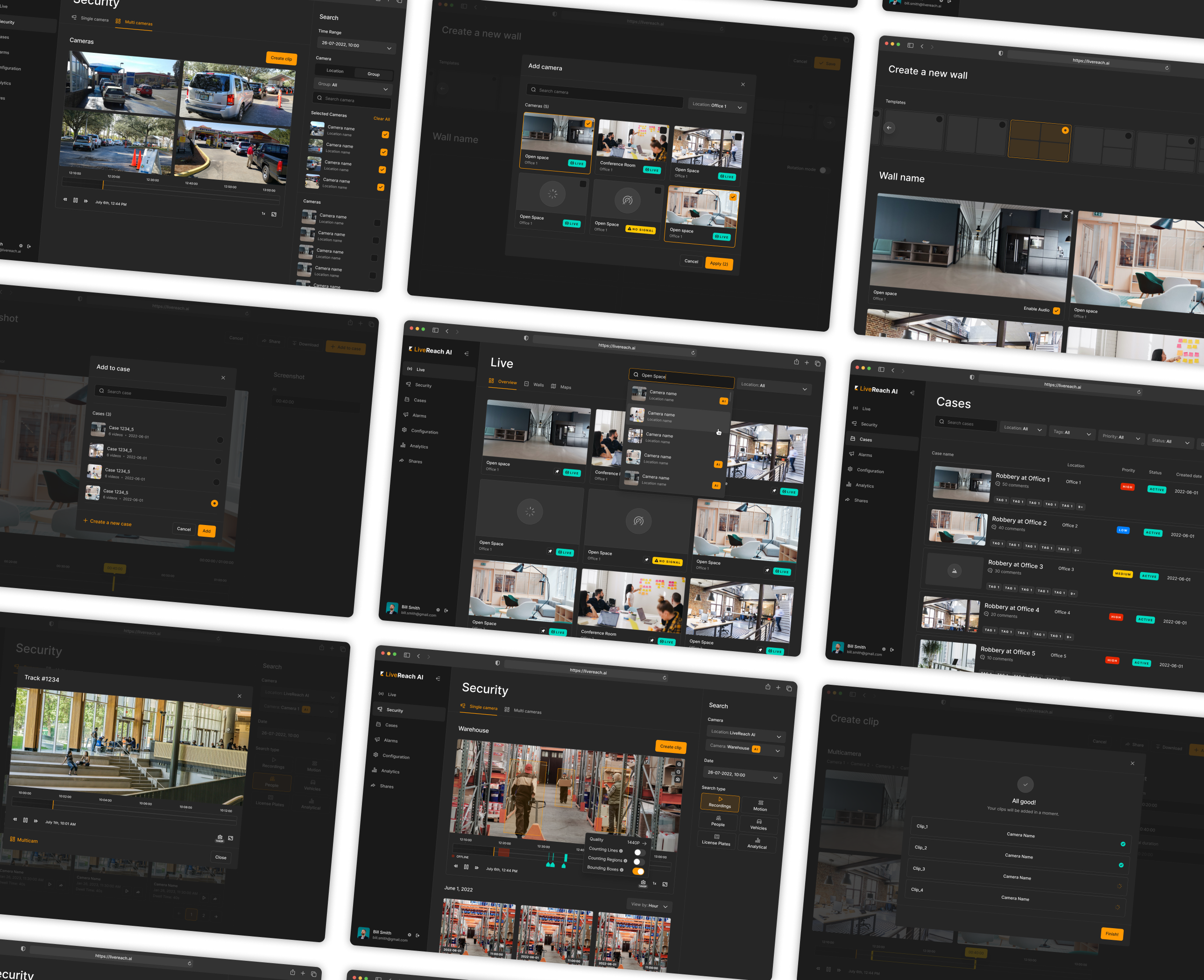
Working closely with key stakeholders and the engineering team, were able to transform the company's product into something much more scalable and stronger for the future by simplifying and optimizing features based on user problems. This redesign has brought LiveReach AI in as a growing competitor in the industry. Having a cohesive visual identity contributes to an elevated and professional look in which new and old customers responded positively to.
